

bennymex
New Member
Hi, I'm seeking for advice regarding my new logo. It is meant to represent health and organic products. Coffee, Tea, Juices, hipster stuff, etc.
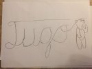
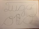
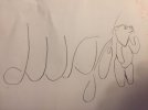
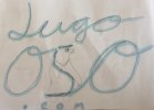
So here is the idea, it is suppose to spell Jugooso. Jugoso means juicy in spanish, Jugo means juice and Oso means bear. Therefore the play on words and the image of the bear.
I'm considering adding a colorful background like pastel fruity mix colors (bunch of blobs)that are inside the margin of the text so that the text will be bigger than the background. Or just plain green. I'm considering whether I want the text inside a blob or over-riding it.
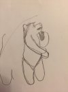
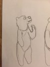
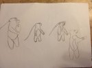
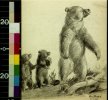
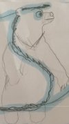
In the images uploaded here are the initial idea, the one which I've parted from in this last creative brainstorming is titled "logo bandera" and the inspiration on which the bear is based on is on "Logo OSO".
I have done a more cartoonish bear using the O's for eyes and the S for a nose looking straight or right. It is cute but I don't feel it gives the right message of nature, deliciousness & health. Don't think I want a cartoonish bear in my bottled drinks, and whatever product I might want to develop in the future (shirts, notebooks, etc)
Any suggestions are greatly appreciated.
I already have a designer (albeit industrial designer) in mind for help creating it. She would be charging me about $50-55usd. Don't know if its worthwhile looking elsewhere in this or similar communities.
So here is the idea, it is suppose to spell Jugooso. Jugoso means juicy in spanish, Jugo means juice and Oso means bear. Therefore the play on words and the image of the bear.
I'm considering adding a colorful background like pastel fruity mix colors (bunch of blobs)that are inside the margin of the text so that the text will be bigger than the background. Or just plain green. I'm considering whether I want the text inside a blob or over-riding it.
In the images uploaded here are the initial idea, the one which I've parted from in this last creative brainstorming is titled "logo bandera" and the inspiration on which the bear is based on is on "Logo OSO".
I have done a more cartoonish bear using the O's for eyes and the S for a nose looking straight or right. It is cute but I don't feel it gives the right message of nature, deliciousness & health. Don't think I want a cartoonish bear in my bottled drinks, and whatever product I might want to develop in the future (shirts, notebooks, etc)
Any suggestions are greatly appreciated.
I already have a designer (albeit industrial designer) in mind for help creating it. She would be charging me about $50-55usd. Don't know if its worthwhile looking elsewhere in this or similar communities.
Attachments
-
 WhatsApp Image 2018-05-01 at 23.25.23.jpeg41.5 KB · Views: 20
 -
 WhatsApp Image 2018-05-01 at 23.25.22.jpeg45.7 KB · Views: 20
 -
 WhatsApp Image 2018-05-01 at 23.25.23(1).jpeg40.8 KB · Views: 19
 -
 WhatsApp Image 2018-05-01 at 23.25.23(2).jpeg44.9 KB · Views: 22
 -
 WhatsApp Image 2018-05-01 at 23.25.23(3).jpeg49.1 KB · Views: 21
 -
 WhatsApp Image 2018-05-01 at 23.25.58.jpeg48 KB · Views: 20
 -
 logo bandera.jpg935.6 KB · Views: 25
 -
 Logo OSO.jpg127.8 KB · Views: 26
 -
 Logo.jpg143.1 KB · Views: 22


