yet another "great" olympics poster

I just don't see how something so vaguely represented (it really does look like a frog) can be used to portray so much meaning.

It's like, yeah there's blue, oh OK that's water then.. or is it sky? Is he flying? There's also a darker patch with what appears to be a torso, two arms and two legs... it must be a human. It's definitely a human. Or it could be a flying frog.

It baffles the mind some times how they can get so much from so little.
 
you could probably think of it like this:

Scenario 1:
Howard puts the work towards a board of pretentious snobs, all think of art as emotion. Howard makes his pitch and babbles on about what it represents and the meaning it portrays. The board excited to the extent of an orgasm burst into applause and demand the piece be put through.

Scenario 2:
Howard puts the work towards a board of average joes who don't really know much about art. Howard makes his pitch and babbles on about what it represents and the meaning it portrays. The board puzzled by what he has said think to themselves that because of all the stuff he has just said he must know what he's doing and so accept the work.

Scenario 3:
Howard sucks ****
 
Hahaha, that made me laugh. It shouldn't though because it's probably true :(
 
I like it, and I like a few of the others, too. Honestly!
But I also paint, given not in this way, but I understand it. I think it's nice.
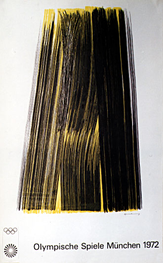
This is my favorite:
1972hartung_0.jpg


These images are supposed to evoke emotion, something all cultures can draw from, all while not excluding by the particular imagery. It also seems the tradition is to have a physically painted poster, something real, textured, and tangible, as the olympics should be.
 
We can also try and look for the positives; at least they are not as ugly as the 2012 Olympics logo- i mean, maybe there are some that say its beautiful (for an painter, maybe) but so far I haven't heard anyone say anything positive about the 2012 logo ^^
 
I'm a painter and I love art but to me that's not art, and yes the logo is also just as bad but really it's not that bad, I'd like to see what other logos were put forward.
 
I think the problem is that these kind of things don't look like they take a whole lot of skill or knowledge to pull off. I mean, for me it just looks like someone has taken a brush with yellow paint, made some brush strokes then gone over it in a different colour. There's just nothing about that which makes me think "wow".
 
It's all tastefully done, the space is used well, colors are pure, and it's balanced. I'm not saying no one here can do the same, we are all designers and understand these things, or should. These aren't, in my opinion, naive paintings.
 
I think the distain, for me anyway, is directed more at the context in which these paintings are used. The actual validity of these being art etc. is a whole different conversation! For me, these do absolutely nothing in the context of a promotional poster or in an art gallery. Pretentious pish!
 
Back
Top