Hi Ash, don't worry, we're not nearly as rough to the new guy as those army boys..!
Honestly, I've just seen about 5 other posts and been disappointed with every single one. I read that you were a soldier-turned-graphic designer. My hopes weren't particularly high, haha. Then I opened up your website... I was pleasantly surprised, to be quite frank. It has a nice feel to it, however, I think there's too much text. It needs some more imagery to quickly distinguish important areas of the page. I also feel that the information hierarchy needs some work. My eyes don't really know where to look once I'm finished looking at the header. I get distracted by the HUGE text beneath the four content boxes.
I'm not too keen on the ROCK boxes, as Gilmore mentioned, what is ROCK? If it has no importance then it shouldn't be so dominant in the design. Another point which Gilmore mentioned, what do you specialise in? Those are some pretty big areas that you cover - I know because I dabble in the exact same things. As a viewer of your website, I've read that you make internet stuff, but in case you haven't realised there is a **** load of stuff on the internet! Do you do Back/Front end Development, SEO? People with money to spend want to know this kind of stuff.
The copy on your website needs some work too, I'm afraid. (You've also used images for plainly styled text (a big no no)) for example:
"Since then, I've worked on some brilliant projects and my kung-fu is much stronger. I made this site so if you can read this I must be getting better."
Ignoring the grammatical errors, I believe there are a number of issues here. What does kung-fu have to do with website development? Is it relevant? Do people like talking to others who use odd phrases in place of more coherent ones? The fact that you made the site they're currently looking at is not a particularly glorious achievement in itself.
You have less than 5 seconds to capture an average users attention. Do you really want to be talking about kung-fu and how you, as a graphic designer/photographer/web developer/project manager (A jack of all trades will never triumph in a global industry. It's hard enough to compete in one industry against people who dedicate all their time to one thing let alone four highly different job types) made your own website?
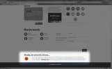
Good start, but it needs work. I also don't like the fact that your site has no navigation, it makes the site feel empty. I keep looking for it but it's not there, there's also no logo. Lastly (it's very late...) the two first pieces in your web design portfolio would not encourage me to hire you as a web designer.