Which logo should I go with??

Which logo do you prefer

  • Logo 1

    Votes: 0 0.0%
  • Logo 2

    Votes: 6 15.4%
  • Logo 3

    Votes: 5 12.8%
  • Logo 4

    Votes: 0 0.0%
  • Logo 5

    Votes: 25 64.1%
  • Logo 6

    Votes: 3 7.7%

  • Total voters
    39
Greg said:
I think I may have the answer to this Berry, I got an auto-reply after sending out the Design Forums newsletter e-mail yesterday...I'm sure Nathan will be back to update us on this on the 18th/19th, and if he isn't I'll be chasing him up on it!! ;)

ANSWER:
A. In Malia getting pissed for 2 weeks :lol:
 
Without knowing what the design concept, it's very hard to say if any of this will work. Will this be on a shirt? Coffee mug? Will it need to be put on a document that need to be sent using Fax?
 
Thanks for all your responses,

I'm back (after a turbulent flight home) and getting back into the swing of things.

The idea behind Blue cube is ....

Blue - Water - The ability to adapt to a clients needs / brief as water does to any given container

Cube - Solid Object - We stick to what were good at and deliver withing the constraints of the practicality.

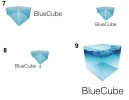
We've tried to incorporate the water aspect of this into the new ideas, be good to hear what you all think (see attached image)

Regards

Nathan
 

Attachments

  • version2.jpg
    version2.jpg
    23.1 KB · Views: 26
Np.9 is definitely the winner for me mate - some really nice work created there. Top marks for the designer :)
 
Hi Nathan,

Did you get your new logo and branding finalized? Would be good to see which logo you went with in the end and how this branding has been applied to other applications :)

Cheers,
Greg
 
Most of the logos you've shown, while nice, aren't logos - they're illustrations. Especially the likes of number nine. It needs to be much simpler.
 
Some really good attempts.

I like the colours and font in #1. Number 4 however, is really nice both conceptualy and graphically. If you can work the colour & font from #1 into #4, I think you have a winner.

Please though, dont go with #6. Its far to complex for a logo, and you can barely see the the text.
 
I don't want to buck the trend of this thread - but i always stay well clear of logos that are - too illustrative - and rely too much on gradients - for me a good logo should be easily identifiable without copy - and look just as clear and concise in full colour as it does in solid black. How would your logo look in a spot silver or foil block? I prefer a couple of your earlier designs as they could be easily 'toned' down to 2/3 colours.

The most striking and memorable logos in my opinion rely on a few colours at most - Adidas, Orange and B&Q to name a few.
 
I chose number 4, although number 6 would be my second choice.
I felt it was less Web 2.0 and had more staying power; I also like the font!
 
<old fart mode> Gr-r-r-radients... It's really hard to see logo behind all that dazzling stuff.</old fart mode>

The best logo there (by far) is I think #8. I'd try making a flat color cube (and not that awkward shape that makes #8 now), "melting" into a drop, probably with one or two very hard white highlights to reveal its shape. Once it's perfect in flat color, only then it's time to apply gradients. But at that stage designer usually finds out that he doesn't need any :)

#6 I think has a lot of potential as well, with the same considerations as above.

Typography is the whole separate issue here. Is there any particular reason for using light Helvetica?
 
Great logos should work in one colour, black and white and not rely on tones, techniques, trickiness or any thing else beginning with the letter T. Simple is, Simple does.
 
Berry said:
Great logos should not rely on tones, techniques, trickiness or any thing else beginning with the letter T.

Typography?
Sorry couldn't resist an attempt to upset the 'T' rule! :p
 
After much deliberation ... tweaking and other stuff in between we've finally settled on our logo you can see it on our brand spanking new website - Home Page: Blue Cube - what do you guys think would be good to know.
 
Logo one achieves a nice, smooth design that is easy to look at. The title has it's place in the logo and fits with ease. It's my personal favorite.

Logo six wins my silver medal. I love how the text fits into the box, but I don't like how the bottom of the box blends together with the clouds and the gradient.

Logo four, however, creates a more technical look with that cut-out 3D box that I don't like. The text just "stands out" there, which doesn't create the striking creativity I look for in a logo.

But still, all the logos are commendable pieces of art! Salutes to you!
 
Timmo & Skipper,
Not sure if you spotted Nathan's latest post?

bluecube said:
After much deliberation ... tweaking and other stuff in between we've finally settled on our logo you can see it on our brand spanking new website

He's chosen a logo now, so think he just wanted to let everyone know and see what comments/feedback came from that :)

Cheers,
Greg
 
Back
Top