

Hi
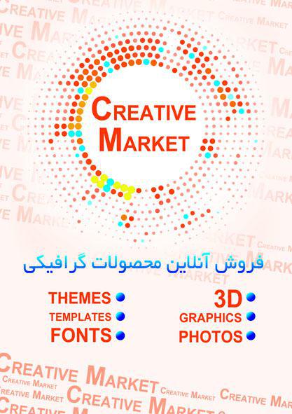
This two poster is about marketing.
Middle sentence is Persian that means it is the selling graphic products Online. This sentence should translate to English because it is incorrect. Except this sentence language that it makes a mistake please you say to me this two design problem. I want a list of problems of this two poster.
Thank you very much
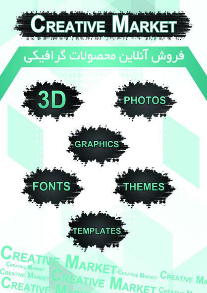