Web Browser Design

Which Design Do You Prefer?

  • Design #2, Rectangle with Shortcut Letters

    Votes: 0 0.0%
  • Other design!

    Votes: 0 0.0%

  • Total voters
    4

broomy

New Member
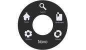
I am in the process of creating a full screen web browser for Windows. When users find themselves the need to search, change page, bookmark, change settings etc. they hold a modifier button (e.g. Ctrl, Alt, or Shift) and a control pops up, allowing them to access different parts of the browser. Following are a few pictures for ideas of this control, please tell me which you would pick and why!

Design #1 App_Fade_Transparent.jpg
Design #2 App_Fade_With_Letters.jpg
Design #3App_Fade_Round_Words.jpg
Or suggest a new design!
 
I think the simplicity of design 1 works for me but from a UX point of view if the menu only shows up with a modifier button then the circle interface would be better as it would mean all buttons would be equal distance from the mouse pointer. So maybe the icons of design 1 but in the circle. Im not sure how necessary the text beneath the icons is. Maybe this could just appear on hover.

I think these sort of icons are normally as minimal as possible without any text to describe what they are. I.e on the twitter mobile app I was a little confused as to what the main buttons did at first, but I soon got used to them. Its the same with Instagram etc...
 
Very helpful reply, I agree! I think that if the mouse jumps to the middle of the round control then it will look good and serve its purpose well. Thank you richimgd!

However, I would now like more peoples opinions, so I can have a more well-rounded idea of the public's opinion! :)
 
Don't agree with the mouse jumping.

You might be hovering in a point, say a game, and the mouse jumping would be horrible say playing Pool and hitting the modifier key.

It would have to be a hard combo modifier keys for it to work like CTRL |

To keep the modifier on the left hand and using the mouse.

Modifier for a left hand mouse could be Ctrl /


The other problem is with handheld devices like tablets, and phones. Most don't have a screen at the ready.


For this reason I don't think a modifier key is a good idea.


But what about a Gesture?

Maybe leaving the mouse in a user-defined corner could bring up the display - perhaps a delay of 1 or 2 seconds (user defined)


This would work well for tablets too.


I like the first design.
 
Good point, I'll keep the mouse in the same position. The gesture is currently in use, I thought that having a key would be a great additional feature.
Thanks Hankscorpio!
 
Design 1 and 2 are quite similar.

Design 3 is different altogether.


Perhaps give the user a choice of a bar or a dial for this pop up?
 
Back
Top