You are using an out of date browser. It may not display this or other websites correctly.
You should upgrade or use an alternative browser.
You should upgrade or use an alternative browser.
Thoughts on personal logo
- Thread starter Siked
- Start date


S
Squiddy
Guest
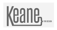
I have to say, it's one of those designs that I look at and can't decide whether I like it or not. I think there's possibly an issue with the height of the text - you might also want to try sticking with all lower or all upper case too.
Regarding your slogan, is it being used in the context of a pun, that you are keen for design or is it a statement; that you work in design?
Regarding your slogan, is it being used in the context of a pun, that you are keen for design or is it a statement; that you work in design?
BenJonesDesign
Active Member
I'm with Squiddy. I like the concept but things can be improved on. Like squiddy said look at deciding on all caps or not. One massive thing that is not good with it is the size of the "for design" part. If that logo were half the size a lot of people wouldn't be able to work out what it says. Think about the format some more, draw up some more ideas but keep the concept as it's good
S
Squiddy
Guest
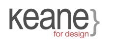
I think I prefer the first one.
The text doesn't look right sitting in the middle, unless you were to include an over line to match the under line starting from the K and make the parenthesis taller. I'm not sure how well that would work out, but you could give it a try.
I decided it was quicker to make something I'm thinking of instead of trying to explain")
Here you go, I've given it some colour too, you could use a coloured element to fit in with your branding identity and incorporate it into your website design if/when you have one.
The text doesn't look right sitting in the middle, unless you were to include an over line to match the under line starting from the K and make the parenthesis taller. I'm not sure how well that would work out, but you could give it a try.
I decided it was quicker to make something I'm thinking of instead of trying to explain
Here you go, I've given it some colour too, you could use a coloured element to fit in with your branding identity and incorporate it into your website design if/when you have one.
Attachments
Paul Murray
Ultimate Member
I think the join where the bracket meets the 'e' would look better curved rather than straight so that the name flows into the brace and back on itself.