

Printsome
Member
Original article posted on the Printsome Blog
It started as an exercise: How would brands be perceived by us if they had a different colour scheme? Could we get used to them with time or would it produce something unimaginable?
You know, my dear graphic design friends, that just imagining, in this case, isn’t enough though. I hope none of the brands displayed here will come after this curious graphic designer claiming copyright abuse or anything similar – as I said, it’s an exercise. An exercise which got interesting when it revealed results which show that perhaps, in the branding world, not all choices are that naive. Let’s start.
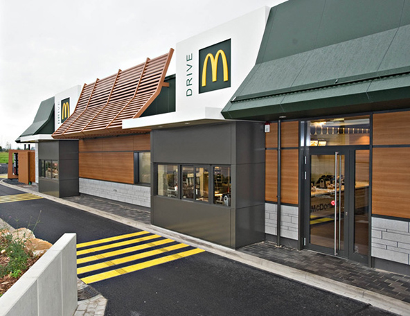
Colour is probably the most important part of branding. It walks side by side and hand in hand with the brand’s visual identity, is there from the very first minute and, if it’s chosen correctly, stays for eternity. Would you get eager for french fries without McDonald’s giant yellow M? Or would Coca-Cola be the same without its magnetic red? We can’t know for sure. Coke doesn’t even have an exact Pantone matching colour anymore (though they recommend 485, apparently), making it almost mythical. Respect.
If you went to design school, one of the first things you’ll have learned is: colours represent emotions. Blue means calm and trust, green means vibrancy and draws eco friendly connotations, red means passion or danger and will make you want to leave a restaurant quickly if it’s plastered on the walls. Or something like that; ‘urgency is red’, they say. Luckily or not, I had a couple of professors of semantics who were very keen about it back in my BA, they made me never forget about the obvious: everything means something, always.
All meanings are associated by simple use, common sense and by the exposure we get to them with time, however they’re not necessarily universal. White can mean peace in western culture, while it represents the masculine (the yang of the yin and yang) in China, so it’s important to keep things in context. Any good company knows they should take that aspect into consideration when moving into new markets, that way they won’t step into a murky, controversial puddle. You can’t lose with common sense.
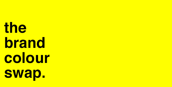
The idea, as you saw in the title, is called ‘The Brand Colour Swap‘. I’ve selected a few of the most well known brands in certain markets and replaced their colours with those from their main competition. Not all the results turned out to be overly revealing, but you can always channel new thoughts when changing the place of things. Kind of like when someone once did what most designers would consider their worst nightmare: the Comic Sans font as the typography for a glutton of famous brands.
Just place the mouse over the images to swap it!
Any particular ‘swap’ you’d like to see featured here on this post? Just leave a comment and it can be updated. Also feel free to comment with your thoughts on the swaps.


Note 1: What’s the colour of McDonald’s european rebrand? Interesting…
We can't post all the Colour Swaps here but you can see more on our blog