Hello, I'm just seeking feedback for an assignment for Open Colleges.
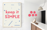
The assignment is to create a 3D based artwork (signage) and a 2D artwork (poster) for a graphic design studio that is focused on the reception area.
For the assignment I chose to do the businesses logo mounted on the wall that is illuminated and a poster that reflects the businesses simplicity.
Although I'm still learning 3D tools I'm surprised how well it turned out only using Gaussian blur for my 3D signage!
thanks!
