You are using an out of date browser. It may not display this or other websites correctly.
You should upgrade or use an alternative browser.
You should upgrade or use an alternative browser.
portfolio design
- Thread starter stevey17
- Start date


Kevin
Senior Member
(ps: this is on your revised design)
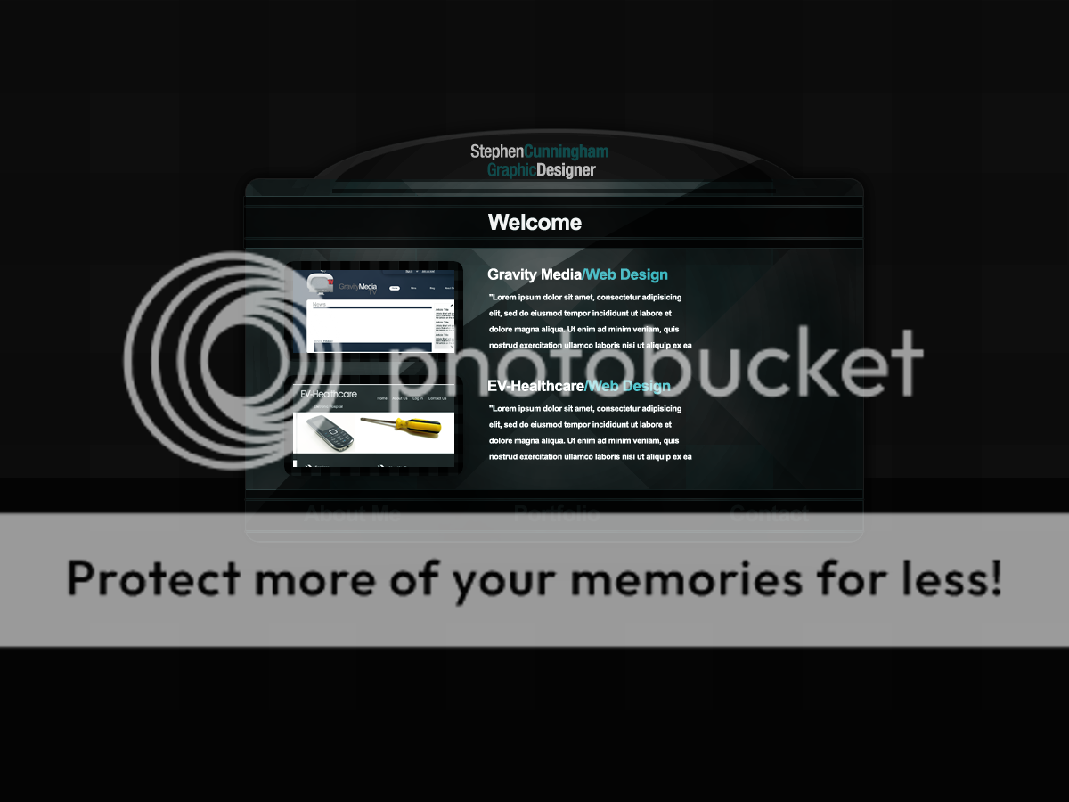
I'm not really liking much of the typography. I think the color difference in the title should be on one line (so your name in white, and your tagline in green). The actual text (lipsum and contact details) are rather small and blurry. But if you make your lipsum bigger, you might want to consider making your preview image a little bit wider and dropping the text below the image, and if you do this you might want to align the Gravity Media title to the left.
I'm a bit doubtful on the visibility of the navigation. For me personally I think it's okay, but some people might not have great eye sight and as such it should be a little bit more visible. Either way, the navigation is a bit too simplistic compared to the rest of the site.
Totally digging that pattern/texture you've got going there.
But all in all I like it. It's much different than a lot of what you see around these days.
Magma
Member
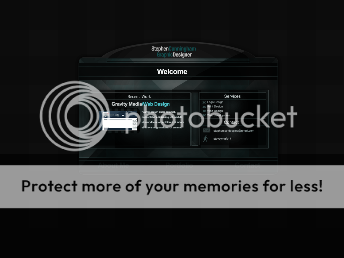
Onartis hit the nail on the head about title and it is a nice portfolio and it's different.
I wouldn't worry to much about the blurry text as that is there because of the aliasing on text in photoshop (or whatever software you used) and when you actually create your site it will be fine!
Also you need to make you're main navigation much clearer, because it blends in too much. Jazz it up abit, it's too boring at the moment.
All in all keep up the good work and I look forward to seeing the site completed!