

Lotusflower
Junior Member
Hey peeps,
I am building a portfolio in view of an interview in 2 weeks (for graphic design) after quite a long time (3 years) after my degree (digital animation with creative advertising), I am putting in a mixture of print and digital material, with each design complimented by a page of the brief & ideas to show process.
The idea is to symbolise unzipping and creativity exploding, I haven't put my name so you have have to open it
BTW the colours have been turned rather garish by Photobucket! The green is meant to be [CMYK: 100, 0, 40, 0] and the purple is meant to be [CMYK: 40, 100, 0, 0]
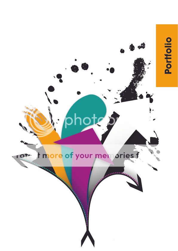
The idea for the brief and ideas page is an outline version of this in the corner with elements drawn in a pencil colour. (working on it now)
Thank you for your time
*-- Edit--*
Here are the complimentary process pages, I have created one for Landscape and one for Portrait for when the image requires it:
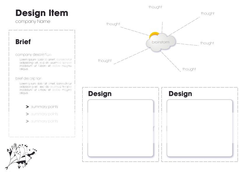
BTW if the text is blown out and too light, it went that way when I exported to Jpeg but it prints fine and dandy from Illustrator
I am building a portfolio in view of an interview in 2 weeks (for graphic design) after quite a long time (3 years) after my degree (digital animation with creative advertising), I am putting in a mixture of print and digital material, with each design complimented by a page of the brief & ideas to show process.
The idea is to symbolise unzipping and creativity exploding, I haven't put my name so you have have to open it
BTW the colours have been turned rather garish by Photobucket! The green is meant to be [CMYK: 100, 0, 40, 0] and the purple is meant to be [CMYK: 40, 100, 0, 0]
The idea for the brief and ideas page is an outline version of this in the corner with elements drawn in a pencil colour. (working on it now)
Thank you for your time
*-- Edit--*
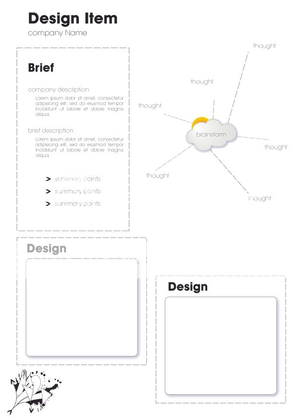
Here are the complimentary process pages, I have created one for Landscape and one for Portrait for when the image requires it:
BTW if the text is blown out and too light, it went that way when I exported to Jpeg
but it prints fine and dandy from Illustrator