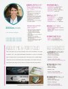
Personal Resume

mhossey

New Member

Attachments

  • Michael Hoss Resume.jpg
    Michael Hoss Resume.jpg
    86.7 KB · Views: 53
Each to there own but I really don't think you should put a picture on your CV.

References should just be available on request, not take up the same amount of space as your personal profile.

Your CV isn't the place to put samples of work that should be on your portfolio, and just use your very best. Quality not quantity.

It all reads a bit like a load of bullet points. You need to make it personal, a company has to get a bit of you from a CV not just a list of things you did in your old job. Maybe talk about something you did really well, something that makes them want to employ you.
 
Thanks Balders, I really appreciate the information you shared. While this is not a CV, some of your points do resonate. I am partial to having a picture so I will probably keep it. Maybe it would be better to put "References available upon request." Or something of that nature
I am still iffy on having a portfolio, the main reason for using this is employers will see a over a hundred resumes when looking to hire, why not show them something up front if it costs you nothing. I have space for them so I took a chance....I would like some more input from other designers on this as well
It does feel a bit rigid, this is partially because I like it like this....I like the idea of adding a project scenario that I completed, or maybe something personal. I thought I did this in the about me section, but maybe it should be more targeted if the personal touch was not conveyed.
Thank you for taking the time to critique, again I appreciate your input and advice as I'm sure you've seen & designed more resumes/CV's than I have - this being my first!
Michael
 
I don't like the line height on the paragraph of the "About Me & Portfolio". It was really straining my eyes to read. Something to consider.
 
When I was doing my CV, I did two one that was being a bit more creative and one that was formal and only had the most valid points on that aimed at the job description.
I know its good to be creative when sending out a CV, personally I wouldn't put portfolio pieces on my CV, I like to keep everything in order.
Somethings I would change with the design, as Tony said the leading is far too big and makes it hard to read on the about section. If you want to get creative with CV I think when there is a theme running through the design and can lead onto other things like the portfolio etc. Also I think the headlines on the about and references section need to be consistent with the other headings.
Good job on the grid though, things do look a lot cleaner with the use of a grid.
 
Thanks Jordan I have considered creating multiple versions, I will take your advice and tailor each one to the specific job. Right now I have somewhat of a resume/CV hybrid. I am based in the US. I'm not sold on not excluding portfolio work yet, I did however check out your CV, classic! Using a map of underground London is awesome - kudos
I'll be removing the about me section since this will be more on the resume standards, in which here in the US employers don't want or expect to see a section like that - I'm finding out. But whatever I decided to replace that section with, the line height and leading and font will be consistent with the rest of the resume.
Thanks so much for your input everyone I really believe this is helping me create a better resume than when I started.
Michael
 
Thanks, glad you like it, I created it as part of my hand in at Uni. I have never send it out was just an infographic showing my CV and also tied in with my project at the time.
That's the beauty of this forum, if you're stuck its good to get some fresh (trained) eyes to give some feedback and advice.
 
This is a personal thing, but fix all your widows. You have several and they're very distracting. :)
And your call to action at the bottom, if you keep it right justified I would make it line up with the right side of the photo above it.
On your skillsets, align the variables (moderate, strong, etc) so that they are all lined up on that side. It's got a very noticeable river and that's easily fixed in indesign.
 
Back
Top