Shannon Gerdauskas
New Member
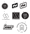
Hello, So I've been concepting out some logos for my Streetwear brand and I must say its super-hard to design for yourself! I want something that speaks visually: "Loud, Classic Streetwear, Unique" Think of brands like: The Hundreds, Neff, Undefeated..
The brand itself is called Goons & Galaxies and it is an advocate for the disclosure of alien life, some taboo government conspiracy with some undertones of psychedelia and outer space-y themes.
I always seem to struggle with branding my own projects correctly. As a designer, I think this is something we often experience as we are so used to designing everyone else's vision.
Any help or suggestions would be appreciated!
If you were me, which logo would you choose to move forward with? (if any)
Why?
Which logo as a consumer of Streetwear fashion would pique your interest the most?
Why?
Thanks!