Logo poll

Hi, I realise I have already done a similar post so this is not intended to be a duplicate, but more of a refined question.

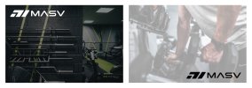
I need to finalise a logo for a fitness/strength brand which sells gym equipment, clothing, supplements etc and have narrowed my choice down to two variations.. but still really undecided.

The only difference between the two is the arrow chevrons, which are to symbolise getting bigger / stronger / enhancement etc.

They are not supposed to symbolise anything to do with military, but the fact that they might do is not a problem as that would still work anyway.

I was previously advised to fix the kerning between the S and V which I have now done, and have provided an updated example.. also mockups of the logo on a piece of equipment and clothing item help give context.

Which do you guys think is better, has the most potential?

Logo 1 on the left... or Logo 2 on the right?


LOGOS.jpg
 
Neither personally, kind of feel the 'military' feel to fitness is a little cliche these days... especially with boot camps and the likes.

I actually think the chevrons linking back to military could be an issue if the fitness group isn't associated with military in any way, ie ex military etc, it could be seen as being a bit misleading imo.
 
Ahh guys and gals!.. appreciate your advice but this has left me in a real dilemma now
:weary:
I was totally set on Logo 1, and even have already had some stuff printed using it.

But I can’t ignore what everyone is saying which is that Logo 2 is better (problem is I personally don’t like lol)

Am I better do you think just doing something different like this new idea below?

Easier to read the word MASV at first glance, and has an Icon. (It’s only a rough draft… need to sort kerning etc)

Still has military vibes I know, bit I like that font.
 

Attachments

  • new idea.jpg
    new idea.jpg
    101.4 KB · Views: 10
The 'A' says roof with window/house to me if I'm being honest... and the new icon looks even more military than before, which again raises the same concerns I had before.
 
Citroen is not linked to the military.

It's logo is shaped after a type of gear used in milling.

I get the idea and connotations with the military but Chevrons are the oldest symbol in history apparently. And used in flag-making, and heraldry.

I think it's fine.
Chevrons are not just military.
But I get the point.
 
Somehow that new one looks like tyre tracks to me. Not keen.

Go with your first one, it's growing on me. At least it's less military than the second one.
 
I'm no logo designer and have no idea how it will look, however, why not duplicate the V and turn it upside down and replace the chevrons with it, almost an up and down arrow which is what you do with weights etc, just a thought.
 
Ok people I have took a new approach to this now and gone in a different direction (see attached)

I think this would work better on a consumer / commercial level, and has better scope for if going into to other areas such as clothing, nutrition etc as well as just equipment.

Got rid of any military assumptions whatsoever.. and now just looks like a general, modern fitness brand.

What are your thoughts?
 

Attachments

  • NEW IDEA.jpg
    NEW IDEA.jpg
    755.2 KB · Views: 15
The 'M' looks very familiar to me but I can't think where I've seen it.....
I prefer it to the older design though.
 
Hi guys, sorry to post about this again but need another round of opinions :grimacing:

See attached.

I have decided I am going with the second style of font for the typeface (not the hexagon / military one) and have re done the 'M' icon, as I didn't like the fact that as [removed link to user] said the last one looked like a person curling the weight., which as I said would have worked if it didn't look like 2 arms instead of one.

Anyhow, could you guys confirm if you think I have now nailed the logo once and for all.

Could you imagine seeing this is your local gym on some of the equipment etc. and not think it looks out of place.

To recap, this is for strength/gym equipment brand, and is supposed to read MASV (meaning Massive)
 

Attachments

  • Untitled-1.jpg
    Untitled-1.jpg
    933.3 KB · Views: 14
Last edited by a moderator:
It looks smart but it doesn't look like an M. Why is it not joined at the beginning, is it supposed to signify something else?

I didn't see 71 until Levi mentioned it but now I can't not see it. Just needs tweaking I think.
 
Back
Top