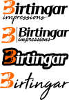
Logo for my company

Robbyjhb

New Member
Hi guys

I would like a crit on my company logo, what we do is hot foil stamping ,die cutting ,exclusive invites for weddings parties ect as well as brand onto leather items, I am working on a new name as well as a logo, Birtingar means impressions in the Icelandic language. I would eventually like to also do logo design, web pages etc... in the the near future, so your crits will be very much appreciated. I have attached five different concepts.

RobbyBertingar Impressions1.png
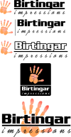
 
I'd drop the hand or get a better one drawn. I understand the association with the sense of touch, but this hand, in particular, doesn't say that to me. The open palm and outstretched fingers give it a sense of urgency, almost danger. Lose the underline too, you can't read the G as easily as you should be able to.

I'd probably swap out the fonts too. The impressions text is in a font that's supposed to be connected like cursive handwriting so I wouldn't use wide tracking on it like that, and the Birtingar text is quite industrial and 'hard' looking. I think you would be better with a softer font, especially if you're intending to attract work involving wedding invites. A serif might work, they're often used for traditional or luxury-feeling brands. Saying that though you probably could use an industrial font but I wouldn't pair it with the cursive font you have now.

To sum up, I think you need to strip it right back. I'd probably look at doing something very simple and then maybe applying effects in Photoshop to mimic what you can do in real life, so a foil stamped version, debossed, version, etc. I generally don't recommend a reliance on colours, or styles for a logo to work, but in this instance, I think breaking that rule would be appropriate.
 
Thank you for the reply , appreciate the tips, I have taken you crits to consideration and hopefully I have improved a little, attached is another 4 concepts.

RobbyBertingar Impressions2.png
 
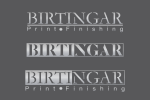
I think this is something of a step backwards. Why feet? Do you need 'impressions' beneath the name? Essentially your company name translates to 'Impressions Impressions'. If you're operating out of Iceland, can you not just go with Birtingar instead? Or maybe add something use 'print finishing' beneath instead to summarise what you do.

If I was designing it I'd probably just keep it really simple and text based, maybe using luxury-feeling typeface. Then I'd print up business card samples of what you do using this mark, so a foil stamped version, something on leather, a die-cut version with your logo cut out (would need to work as a stencil). The aim would be to have something incredibly simple that you can use in a multitude of contexts like this.

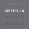
birtingar.png

This is a quick idea and I'm obviously not suggesting you use it. It supposed to represent how one simple logo mark (using a stencil font here to allow for die-cutting) can be used in different ways to get across what your company does. What I'm saying is think about how your branding can work for you. Rather than it being a symbol, your business name and a tagline that represents what you do, let it be something simple and flexible you can use to demonstrates your capabilities.
 
Back
Top