AbrahamArt
Junior Member
Hi! i am a beginner graphic designer, altough, i've had several jobs and have had a logo for years, now it's time to go ahead becouse i'd like to do this as a full time job (so far it was rather a hobby, i had some clients by fortune but that's all).
so i have a logo idea and i would like to get feedbacks as im not really into logo design - as you can see =).
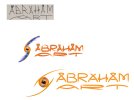
the 1st logo, above, is just for show the early beginnig, i drew it when i was 10. the 2nd, in the middle, is the more serious one, i used it so far. the last one, at the bottom, is a simplified, enhanced one, the latest "improvement". the previous 2 have been uploaded in order that you can see the process and they might help when giving me advices.
i tried to consider all the basic logo design laws (how it looks like grayscale, etc.). my idea for concept is to make the logo a little bit "dynamic". i mean, i think that its not a must to take the symbol always to the same position and next to the text. it can be sometimes above that, a bit bigger/smaller, etc. same as the two bent lines around the circle symbol. i suppose, the logo would be still easy to recognize & memorize.
thank you in advance for help!
so i have a logo idea and i would like to get feedbacks as im not really into logo design - as you can see =).
the 1st logo, above, is just for show the early beginnig, i drew it when i was 10. the 2nd, in the middle, is the more serious one, i used it so far. the last one, at the bottom, is a simplified, enhanced one, the latest "improvement". the previous 2 have been uploaded in order that you can see the process and they might help when giving me advices.
i tried to consider all the basic logo design laws (how it looks like grayscale, etc.). my idea for concept is to make the logo a little bit "dynamic". i mean, i think that its not a must to take the symbol always to the same position and next to the text. it can be sometimes above that, a bit bigger/smaller, etc. same as the two bent lines around the circle symbol. i suppose, the logo would be still easy to recognize & memorize.
thank you in advance for help!