You are using an out of date browser. It may not display this or other websites correctly.
You should upgrade or use an alternative browser.
You should upgrade or use an alternative browser.
Logo design feedback
- Thread starter Helenscottnz
- Start date
Wardy
Well-Known Member
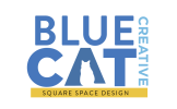
The second one could work, with the cat in the A (although it's a white cat), but they all need refining/simplifying. Have you tried one with just the A made with a solid blue cat silhouette, it might work?
I don't understand where the Squarespace thing comes in and why it's needed, it makes the whole thing too complicated and just 'added-on' and like it's two different companies.
Apart from the fact that Squarespace is a very well known website building platform.
I don't understand where the Squarespace thing comes in and why it's needed, it makes the whole thing too complicated and just 'added-on' and like it's two different companies.
Apart from the fact that Squarespace is a very well known website building platform.
fisicx
Active Member
Not sure what a Squarespace compnay is. Do you mean you just build squarespace websites?
The second one sort of works but I'd prefer to see a proper A - not sure you need a cat. You also need to think about what you want to use for a favicon. And square logos are far less effective on a phone than something more linear.
The second one sort of works but I'd prefer to see a proper A - not sure you need a cat. You also need to think about what you want to use for a favicon. And square logos are far less effective on a phone than something more linear.
Levi
Ultimate Member
Yeah first thought was... why does it have squarespace stuck in the design, they're essentially a website hosting company (with a lot of premade templates) and well I don't stick my hosting company on my branding.
If I'm being totally honest, I don't really like any of them... A seems quite familiar (I feel I've seen it before somewhere), B is the 'obvious' design and C just isn't doing it for me.
If I'm being totally honest, I don't really like any of them... A seems quite familiar (I feel I've seen it before somewhere), B is the 'obvious' design and C just isn't doing it for me.
Different shades of blue going on.


