Logo Design Critique Please

Jones_ink

New Member
Hi everyone, total newbie to this forum.

I would really appreciate some critique and guidance on my logo design. I don't think family and friends are honest enough so I would like some professional opinions, please.
I find it so hard to decide for myself and after a long time thinking I've finally come up with this... Please be brutal :)
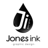
Artboard 2 B&W.pngArtboard 2 greyscale.pngArtboard 2.png
 
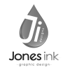
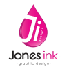
It looks ok. The highlights on the droplet are a bit ropey, and you don't need 'designs' on there - It's like you have two different names.
Did you try the J going straight up out the top of the drop?

I don't think you need the shadow on your name and I would lose the gradation on 'ink', unless it's an optical illusion.
Personally, I've never liked that 'e' - there's a lot of nicer fonts out there.
 
JI Designs
Jones Ink
Or
Jones Ink / Graphic Design

I can read it 3 different ways.

Why not just go with
Jones
Graphic Design

What's the ink part about?
 
Where are you planning to use this logo? Will it be on your business cards, t-shirts, website, adverts, shop window, favicon?

Any of your designs might work on some but not all media.
 
It looks ok. The highlights on the droplet are a bit ropey, and you don't need 'designs' on there - It's like you have two different names.
Did you try the J going straight up out the top of the drop?

I don't think you need the shadow on your name and I would lose the gradation on 'ink', unless it's an optical illusion.
Personally, I've never liked that 'e' - there's a lot of nicer fonts out there.

Thanks for your input.
"It looks ok" to me means its bad... I have multiple copies with slight variations of the logo, the highlights I was going for a more 3d look (for web), should I scrap them and just do solid?
I tried J out the top but it didn't resemble a J then... As for the shadows, not keen myself and meant to take them out before uploading.
Any font suggestions?
 
JI Designs
Jones Ink
Or
Jones Ink / Graphic Design

I can read it 3 different ways.

Why not just go with
Jones
Graphic Design

What's the ink part about?

Jones Ink is the name of the company and Jonesinkdesigns is my web address.
The ink is meant to be a play with words for inc. and ink being pen/graphics etc
Is it too confusing? I want a logo separate to identify the company and can be used as watermarks etc.
 
Where are you planning to use this logo? Will it be on your business cards, t-shirts, website, adverts, shop window, favicon?

Any of your designs might work on some but not all media.
Yes all stationary, website, FB, Instagram. I'm hoping to open shops also on eBay, adverts.ie etc selling personalised bits eg baby wall prints etc.
 
Realistically I would like 2 logos or a variation of each other.
My main goal is wedding stationery, personalised prints etc, which I feel needs an elegant logo, but I am hoping to also attract businesses /events which is the need for a professional logo.
 
Jones Ink is the name of the company and Jonesinkdesigns is my web address.
The ink is meant to be a play with words for inc. and ink being pen/graphics etc
Is it too confusing? I want a logo separate to identify the company and can be used as watermarks etc.

Yep, too confusing. Would never had gotten inc. from ink and an ink droplet.

If it's called Jones Ink Designs - then the logo should only say that.
 
Yes all stationary, website, FB, Instagram. I'm hoping to open shops also on eBay, adverts.ie etc selling personalised bits eg baby wall prints etc.
In which case you need to separate the 'drop' from the words.

For example on a website you need to keep the height as small as possible - especially on small screens - so you will need the words to the right of the drop. But then if the drop is only 30px high none of the detail will show.

The name of the business should really be plain text (Google likes this) which means the dropshadow isn't really needed.

Consider also that people and businesses are interested in your products not you. In most cases they couldn't care less if you have a logo or not. On eBay nobody will ever see it.

A logo is all fine and dandy but it's not something to sweat over right now.
 
If it were me I would reduce the droplet in size and simplify it a lot, maybe just one highlight on the inside of the J, or even just have it a lot smaller as a dot on the i?
Ink needs to be the same size and weight as Jones.

The choice of font is up to you, but I did notice you could have a nice mirrored angle of the J and k, if you understand what I mean, if you find the right font.
 
Ok, thank you all for your help. I will have to have a rethink and see which is the most important part of the logo.
When I figure it out I'll post it, and see what ye think.
Thanks again :)
 
Back
Top