@Johnstone Thanks for the feedback! In regards to the slider I figured that due to the content and layout of the landing page it doesn't really need two areas to display work, that's what the previous work section is for. It would feel counter intuitive to have a minimalist design that utilises space so poorly, don't you think? I thought it would be better to use it in a more unique way and try to pique peoples interest in my site right from the start. Certainly putting previous work examples up there is a good way to do that, but I just felt that a different approach was needed with this layout.
The slides are time consuming, but I enjoy doing it and as I do more slides the process is becoming much quicker. I may have an issue with site appearing static, so I will attempt to rectify that by adding in some areas of social activity further down the page. I don't feel that the sliders would need to be changed on a regular basis as it's fulfilling a different role than usual, which is to communicate a specific message to potential clients, which isn't going to change any time soon.
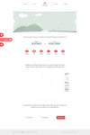
Part of me thinks you also haven't quite understood how it's meant to work? Where you say that a shot of a moonlight town won't help me to attract clients for web design, well as you would have seen from the previous comments in this thread, there are actually 3 separate slides and its primary purpose is to convey a message, not to give a preview of the work I do, they can scroll their mouse wheel a minute amount for that:
Slide 1:
http://puu.sh/38Wt1.png
Slide 2:
http://puu.sh/38VRJ.png
Slide 3:
http://puu.sh/38VSh.png
Also, the site isn't specifically aimed at just website design, so I don't think it's the end of the world if it doesn't scream "I do website design". I believe that every site should be totally unique, especially for businesses, so I'm not sure that doing what I'd do for a client is really going to work in this situation.
Thanks for your feedback, it's really appreciated
")
@Alex (Gilmore) Thanks mate, glad to see you back here again! Hopefully you stick around
I look forward to having it built so I can actually finish it but I've just started a new project so might not have too much time for it all. Hopefully I can just make some time for it