You are using an out of date browser. It may not display this or other websites correctly.
You should upgrade or use an alternative browser.
You should upgrade or use an alternative browser.
Just a header
- Thread starter With Nothing Added
- Start date


GilmoreVisuals
Active Member
The simplicity is good.
I would personally stick to 2 fonts and to 2 variants of purple. I like to see navigations on the left or right, not in the middle. But that's just my personal preference.
You could use the flower vector you have an make it cover most of the design as a background at 10% - 20% opacity rate? Not sure, worth experimenting around maybe.
With Nothing Added
Junior Member
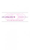
Makes sense; I’ve used 9%. I’ll think about the fonts; maybe it’s best if I do that when I’ve chosen an html font for the copy (I’m not using web fonts because they seem to lack cross browser compatibility). So far the idea is: a font for the logo, one for the menu and everything that is part of the dialogue with the viewer, and one that suits a playful style for the slogan. I do like the menu on the right, especially if is also aligned on the right; it communicates stability, I think. But I’m experimenting with doing the header, the footer and the main area one at a time. Let’s see what comes out 
In the dictionary I’ve found that functionality can be both countable or uncountable. Not sure what communicates development best. Or does it make a difference?
In the dictionary I’ve found that functionality can be both countable or uncountable. Not sure what communicates development best. Or does it make a difference?
Attachments
With Nothing Added
Junior Member
Hi!
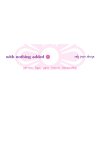
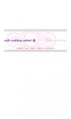
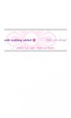
I made some small variations. Maybe when the design is all done I'll remove the pattern on top, or maybe not, not sure.
I've made more space between the large transparent ding and the pattern on top and underneath. Decrease the transparency to 11%. I've removed one colour (the lettering now is the same colour as the logo) etc..
I like Mistral for 'only pure design' although it's been used a lot in every sort of design, including in plastic bags in a super market. It's a good font though.
Please tell me your opinions. Thanks!
Attachments
With Nothing Added
Junior Member
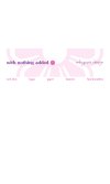
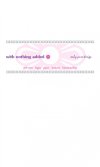
Hi all. I made some more changes to the design; every mock-up have different script fonts, but they can be shifted.
That’s a very good point. I think it’s because Mistral is a form of continental hand writing. In the UK no one writes like that. Thanks for noticing it.
Levi said:the only pure design font doesn't work either, you can't easily read it
That’s a very good point. I think it’s because Mistral is a form of continental hand writing. In the UK no one writes like that. Thanks for noticing it.