jhdesigns
Junior Member
Hi all,
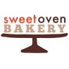
I'm new to the forum but ready to jump in and get some feedback on this logo for a small bakery called "Sweet Oven Bakery." The client makes scones (nothing else) and in the design brief I prepared she stated that she wanted a logo that was friendly, cozy, simple, understated but sophisticated.
Client loves the logo and the concept but I'd really like to tweak it more.
Specifically, I'd like feedback on the typeface choices as well as the kerning/tracking that I've done.
Thanks,
Julie