You are using an out of date browser. It may not display this or other websites correctly.
You should upgrade or use an alternative browser.
You should upgrade or use an alternative browser.
Critique my logo, please!
- Thread starter mrmomoart
- Start date


Can you critique mine?

sprout
Active Member
As others have said, the only thing anyone can critique is its aesthetic merits.
With no context and no brief, it is meaningless as a logo. Aesthetically, it leaves a lot to be desired, the integrity of the curves is a bit all over the place. Where one compound curve blends into another you are getting visual ‘corners’ and sharp points. This is particularly noticeable on the underside of the ear and where it goes into the neck. You are getting some odd visual tension happening in the neck itself and the negative space between the body and the neck. The curve of the back is a little inelegant. and needs the apex raising a little, in my opinion. There are other little things, I could go on about, but hopefully you can see what people are getting at. We need to know what you are communicating and who to?
These sorts of things are all that can be critiqued without context. As Wardy said, it’s not a logo. It’s a shape / silhouette.
I caveat this with the fact I have no idea about your age and education level. If you are still at school, then some of this may seem a little harsh, as you would not be expected to know the ins and outs of branding and visual communication at your stage of the game. What I would suggest, is if you do want to pursue design as a subject, then read as much as you can – but read in the right direction. There is a lot of misinformation out there on the internet. Choose the right books, like Wally Olins’ On Brand. There are many more.
If you let us have more of an idea of your education level, we can tailor comments and help accordingly.
I caveat this with the fact I have no idea about your age and education level. If you are still at school, then some of this may seem a little harsh, as you would not be expected to know the ins and outs of branding and visual communication at your stage of the game
If you let us have more of an idea of your education level, we can tailor comments and help accordingly.
Yeah good point that
")
mrmomoart
New Member
Thanks for your critique. It was helpful. By critique of my logo (I tried to design a logo, and that's why I wanted to know and to learn how I could improve it. It's funny when some say it's not a logo, but they don't say why it isn't. Didn't I ask for a critique ?), of course I meant "aesthetically". When we look at the logos, most of the time we don't know the businesses behind them. We look at the logos and they tell us what they're about. And maybe they don't. For example, when you look at the logo of Apple company, and you don't know anything about Steve Jobs or their business, can you say it's related to a computer business ? I guess not! It's just a bitten apple.As others have said, the only thing anyone can critique is its aesthetic merits.
With no context and no brief, it is meaningless as a logo. Aesthetically, it leaves a lot to be desired, the integrity of the curves is a bit all over the place. Where one compound curve blends into another you are getting visual ‘corners’ and sharp points. This is particularly noticeable on the underside of the ear and where it goes into the neck. You are getting some odd visual tension happening in the neck itself and the negative space between the body and the neck. The curve of the back is a little inelegant. and needs the apex raising a little, in my opinion. There are other little things, I could go on about, but hopefully you can see what people are getting at. We need to know what you are communicating and who to?
These sorts of things are all that can be critiqued without context. As Wardy said, it’s not a logo. It’s a shape / silhouette.
I caveat this with the fact I have no idea about your age and education level. If you are still at school, then some of this may seem a little harsh, as you would not be expected to know the ins and outs of branding and visual communication at your stage of the game. What I would suggest, is if you do want to pursue design as a subject, then read as much as you can – but read in the right direction. There is a lot of misinformation out there on the internet. Choose the right books, like Wally Olins’ On Brand. There are many more.
If you let us have more of an idea of your education level, we can tailor comments and help accordingly.
I don't think it's necessary to know my background. Consider me as a person who is learning to design logos, and that's why I'm here in this forum. It doesn't matter I'm 7 or 70, or I'm at school or a self-taught. What matters is the logo. I agree that I should work harder and smarter to become a better designer. I hope my next logo would be a better one.
sprout
Active Member
They do say why it isn’t a logo – and no you don’t need just an aesthetic critique.It's funny when some say it's not a logo, but they don't say why it isn't. Didn't I ask for a critique ?), of course I meant "aesthetically". When we look at the logos, most of the time we don't know the businesses behind them. We look at the logos and they tell us what they're about.
Without context, it is a drawing, a diagram. As you say, the logo tells you what it is about. That doesn’t happen by accident. That takes years of learning to know how to do it. It requires research – usually a fair bit of it – to be able to understand the demographic you are trying to communicate to. You need to understand your client, their business and what they want to say. You need to know how the human brain accepts information, colour theory, typography (hugely important), etc, etc. Most importantly, even when you know this, you need to fully understand how a logo is only part of a brand, which in turn is the embodiment of any organisation’s culture and identity.
So without any background information about the problem you are trying to solve, a logo is only meaningless decoration. When you look at the example you used, Apple, that is not just a decorative symbol. It is the personification of all the emotional capital that is Apple. You have an emotional response to it and you have a different one to the Nike tick. Immediately you read that, your brain recalls what you feel about Nike, not what they do. Next Red Bull. Again, an entirely different set of emotions.
This is why I suggested reading as many books as you can, so you fully understand what a logo is.
To an extent, your age does matter. If you were 7, people’s response / tone of voice would differ from if you were 70. That’s what brand does, it’s the tone of voice of an organisation. Your background does matter too, in terms of education level. People then know what – rather than how – to respond. If you want to learn seriously and make a career of it, then the likely suggestion would be to get a formal education. If you are a hobbyist, then the response would be different. If you were 14 and exploring the possibilities, the advice we give you would be different again. [Somewhat, ironically, I have just noticed that you published your age in your profile anyway.]I don't think it's necessary to know my background. Consider me as a person who is learning to design logos, and that's why I'm here in this forum. It doesn't matter I'm 7 or 70, or I'm at school or a self-taught. What matters is the logo.
All of this is part of what you need to know re design and branding. You need to know what questions to ask to get the correct information from your clients in order to communicate correctly.
Finally, slightly snippy, petulant responses…
…are unlikely to get the response you hope for from professional designers who come here and give their time and experience for free. I was really close to ‘sod you then’ and not bothering to answer.…Didn't I ask for a critique ?), of course I meant "aesthetically"…
Hope this all helps clarify.
mrmomoart
New Member
I didn't say the designers shouldn't research for information or they don't need the background of the clients and brands. What I'm saying is the designers don't need to attach all these information to their logos. The logo, if it's good enough, speaks for itself. And I'm not saying I did a great job. I accept what you said about mine.Without context, it is a drawing, a diagram. As you say, the logo tells you what it is about. That doesn’t happen by accident. That takes years of learning to know how to do it. It requires research – usually a fair bit of it – to be able to understand the demographic you are trying to communicate to. You need to understand your client, their business and what they want to say. You need to know how the human brain accepts information, colour theory, typography (hugely important), etc, etc. Most importantly, even when you know this, you need to fully understand how a logo is only part of a brand, which in turn is the embodiment of any organisation’s culture and identity.
So without any background information about the problem you are trying to solve, a logo is only meaningless decoration. When you look at the example you used, Apple, that is not just a decorative symbol. It is the personification of all the emotional capital that is Apple. You have an emotional response to it and you have a different one to the Nike tick. Immediately you read that, your brain recalls what you feel about Nike, not what they do. Next Red Bull. Again, an entirely different set of emotions.
Do you look for every designer's background and age to critique their works ? Obviously, no! If the logo is good, it's working well. And if it isn't good, it's not doing good. There are millions logos around us, who cares about their designers' lives ? That's why I believe the critique must be "aesthetically", and I thank you for it.To an extent, your age does matter. If you were 7, people’s response / tone of voice would differ from if you were 70. That’s what brand does, it’s the tone of voice of an organisation. Your background does matter too, in terms of education level. People then know what – rather than how – to respond. If you want to learn seriously and make a career of it, then the likely suggestion would be to get a formal education. If you are a hobbyist, then the response would be different. If you were 14 and exploring the possibilities, the advice we give you would be different again. [Somewhat, ironically, I have just noticed that you published your age in your profile anyway.]
I respect everyone who responds well. I really appreciate it. But we all are here to teach and learn, aren't we ? If the answer is no, then what's the use of this forum ?…are unlikely to get the response you hope for from professional designers who come here and give their time and experience for free. I was really close to ‘sod you then’ and not bothering to answer.
sprout
Active Member
Out in the wild, of course a logo doesn’t need to be explained. It has context. It is attached to a product or service. When you want a critique, there is no context. What may be a brilliant logo for a small town vets, may be a complete failure for a global tech company. Context it everything.
Wardy
Well-Known Member
A mark cannot stand alone as a logo until the company or brand is well established. Until then it needs to have a name with it at least, if not a description of what they do too.
Without going into lots of detail which Sprout touched on, your design is not aesthetically pleasing to the eye as some of the curves are 'wrong'. If I was doing it I would find lots of photos and do lots of sketches in pencil
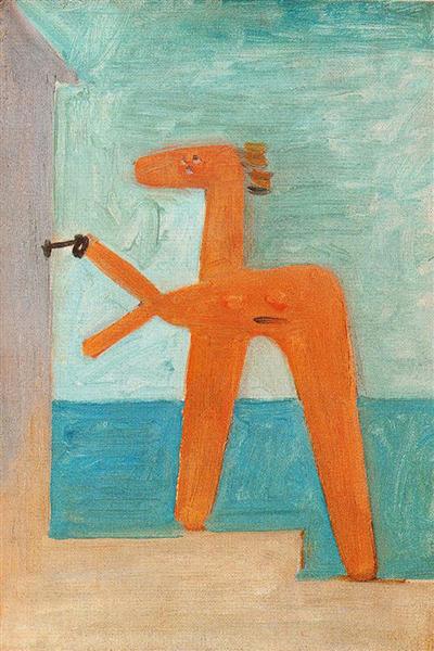
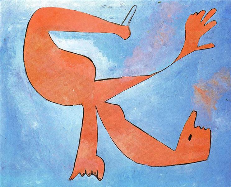
and then simplify and hone down before going to the computer. Attached are a couple I found online. Although neither is perfect, they've tried to get the curves nice and simple and yet it still looks like a hare.


Without going into lots of detail which Sprout touched on, your design is not aesthetically pleasing to the eye as some of the curves are 'wrong'. If I was doing it I would find lots of photos and do lots of sketches in pencil
and then simplify and hone down before going to the computer. Attached are a couple I found online. Although neither is perfect, they've tried to get the curves nice and simple and yet it still looks like a hare.
sprout
Active Member
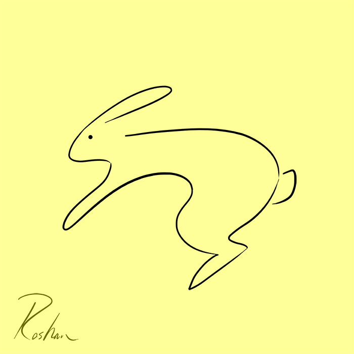
Again; just a drawing. Better in terms of the lines and the smoothness, but it is not a logo. Feels like we are going round in circles here.I wonder what you might think of this new logo. Imagine its for a local shelter for rabbits named Bobo Rabbit Society.
I drew both of them after many sketches. None of them are done all of a sudden:
Wardy
Well-Known Member
I like that as a basis, it's getting there and the curves are a lot better. For use as a logo I think the lines would have to be a lot thicker in places, and personally I would try and add at least a hint of the other legs.
As part of a logo I think it's more 'Rabbit Design Associates'.
As part of a logo I think it's more 'Rabbit Design Associates'.
mrmomoart
New Member
Well, I have hundreds of rabbits, because as I said I'm practicing, and trying different lines, forms, and shapes, and so on. But I guess that's enough for now, and I shall sketch moreAs part of a logo I think it's more 'Rabbit Design Associates'.