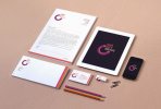
could you please offer me some comment, crits and/or opinions on this branding please. Looking for ways to improve it that i might not have considered yet
I was going to suggest that the identity has an awkward shape/composition, but then I saw it in context. I can't really offer any suggestions to be honest, except maybe the mark is a bit too big on the letterhead. Personally I'd make that smaller and make the type taller/narrower.
Yea it was an odd shape to begin with but once I made sure there was a protection zone around the logo I got it to work.
Looking back at the letterhead, Yes you are right, Ill change that.
This site uses cookies to help personalise content, tailor your experience and to keep you logged in if you register.
By continuing to use this site, you are consenting to our use of cookies.