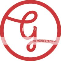
Kind of reminds me of a baseball... the rounded shapes combined with using red don't help lolgcol90 said:
You are using an out of date browser. It may not display this or other websites correctly.
You should upgrade or use an alternative browser.
You should upgrade or use an alternative browser.
Branding and identity
- Thread starter gcol90
- Start date


S
Sean Lee-Amies
Guest
If you want to lose the baseball reference, why not try breaking up the intersection where the tail of the g meets the outer circle, so that there is essentially a visual end to what would be an incomplete circle rather than it continuing round forever.
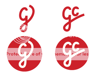
okay, gonna put a hold on the baseball one for now. based this off my signature (well the 'g') but the gc one reminds me of an existing logo for a shop or something. not sure though? might get rid of the circle, it's annoying me now. actually this whole process is. wish i'd been named something with less curvy letters.
anyway, stronger than the previous attempts?
anyway, stronger than the previous attempts?
S
Sean Lee-Amies
Guest
Yeah I think I preferred the previous ones!
onedayteam
New Member
Hi, I know that I'm new and should probably maintaining a low profile here. But I'm also voting for the "baseball" one.gcol90 said:okay, gonna put a hold on the baseball one for now. based this off my signature (well the 'g') but the gc one reminds me of an existing logo for a shop or something. not sure though? might get rid of the circle, it's annoying me now. actually this whole process is. wish i'd been named something with less curvy letters.
anyway, stronger than the previous attempts?
The two at the bottom reminds me of Pinterest. idk lol Anyone having the same feel about them?
scotty
Ultimate Member
Too much detail.gcol90 said:I'll see if the other grows on me whilst i fiddle.
T
Tony Hardy
Guest
I think you were closer with this attempt. If you want to lose the baseball look - lose the red?gcol90 said:
haven't had much free time but gave up on the previous ideas. they kept reminding me of this.

this has genuinely been harder than any other project i've had lol, and i've taken too much time on it, and i wanna update pretty much everything on my portfolio.
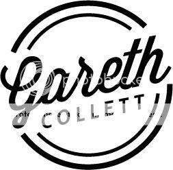
soooo... am gonna work more on this. i went for a 50's vibe, and am diggin' it. it's not too complicated, it's just my name, but i reckon this will do the job once it's finished up.
this has genuinely been harder than any other project i've had lol, and i've taken too much time on it, and i wanna update pretty much everything on my portfolio.
soooo... am gonna work more on this. i went for a 50's vibe, and am diggin' it. it's not too complicated, it's just my name, but i reckon this will do the job once it's finished up.
S
Sean Lee-Amies
Guest
Yeah I like that 50's vibe version! I think there just comes a point where you need to just pick one and run with it. You can always re-brand further down the line, when you've got more projects under your belt. Until then, probably best to spend your time getting said projects, rather than on endless variations of your logo!
adamssmiths
New Member
thanks for sharing such a great information with us