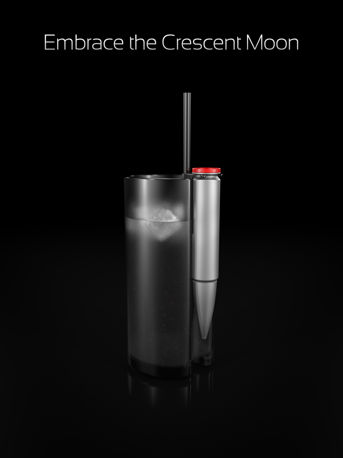
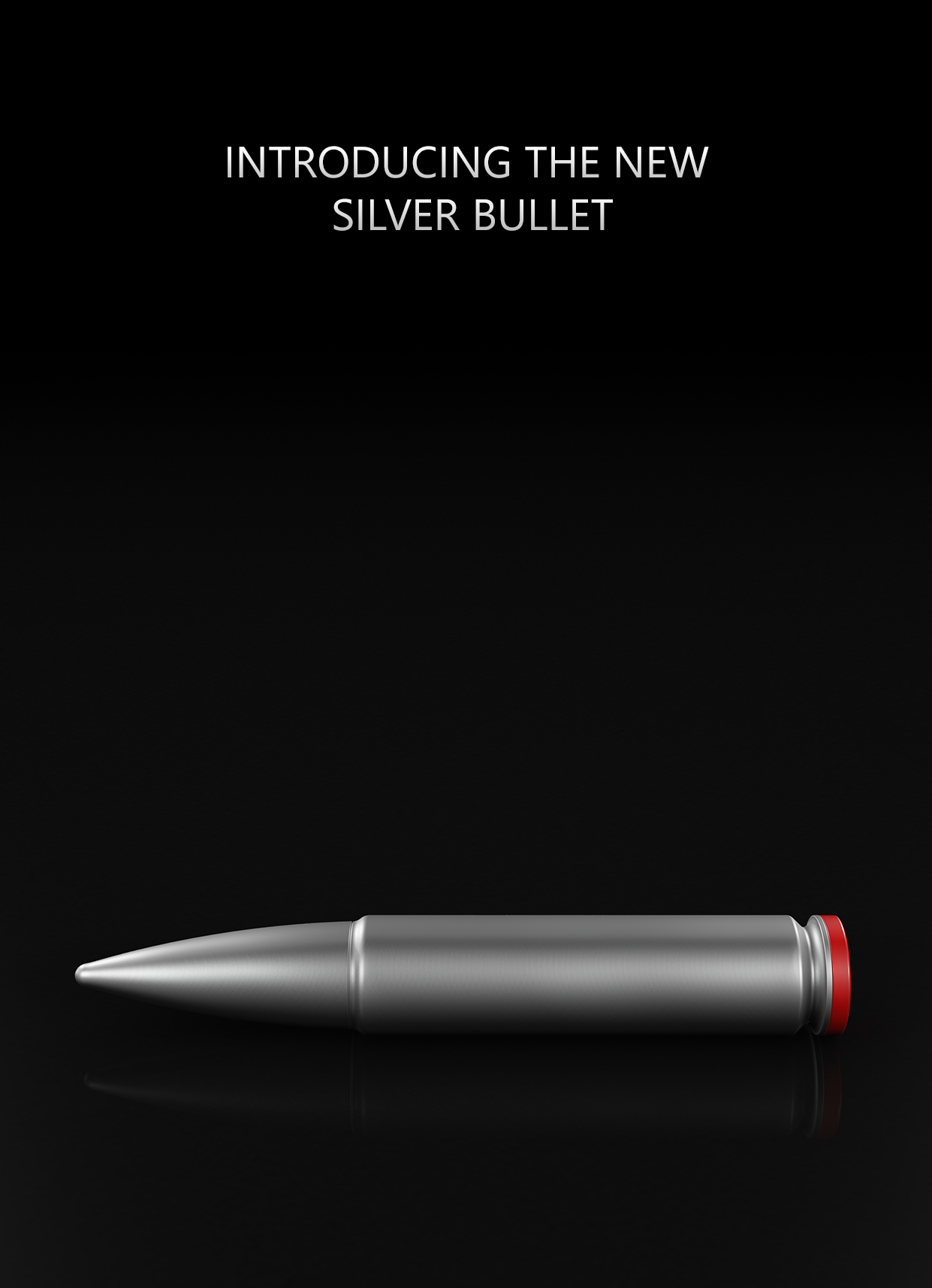
Well after winning the competition I decided to take some time to just 'evolve' the design to take on board the reviews/critiques. Again this was done in spare time so there may be a few bits and pieces not quite perfect.
You can see the original entries here and the reason behind the original design. It also has most of the comments although there are some found in the results thread too.
A quick breakdown of the comments basically thought
Feel free to comment etc.
You can see the original entries here and the reason behind the original design. It also has most of the comments although there are some found in the results thread too.
A quick breakdown of the comments basically thought
- the design was more bar/club orientated even though my concept was more aimed at the home soft drinks market.
- the text on the page was a bit dated
- the pictures weren't 'advert' ready - they weren't meant to be but I'll take that on board here anyways.
- My own self critique a few days later picked up on texture issues and orientation of the presentation.
- The brand was dated/better than I gave it credit for (not my area of expertise) - I thought they weren't very refined but I said at the time they weren't 'final' they were there for 'reference'
- low res imagery, easily solved given enough time
Feel free to comment etc.

")