wine label

Cope

New Member
hello, basically iam entering the a competition to design a wine label for a company called
Sovio, i quite like the work so far, i think ive spent a good 4 hours on this maybe more, but it seems to lack something, like there should be something in the negative space... ive tried various floral brushes but it looks pants. any help or critisism is appreciated
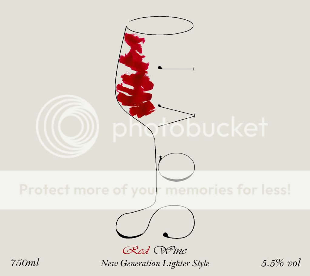

photoshopeditsovio45.jpg


Thanks :)
 
Should there be a comma between 'New Generation' and 'Lighter Style'? So it would read: New generation, lighter style. Is this the company's tag line?

I like the work you've done so far :)

Not sure about the white portions in the red where you're alluding to wine. Feels a little like a dodgy photoshop cut-out. Could work better cleaned up.

Otherwise, simple is better in my opinion - wouldn't go for the floral brushes.

Maybe consider sculpting the text a little so that towards the top it mirrors the shape of glass? Just a thought - don't know if it will work.

/Doug


thanks yeah completely agree, that exactly what i was after thanks.

so you think should leave the negative space?
 
Happy to help.

Yes :) negative space is nice.

Gives the lines space to breath and lets the eyes rest.

Not saying that something in there wouldn't make it better... Just that I can't think of anything. Experiment and see if anything works.

/Doug
 
Back
Top