You are using an out of date browser. It may not display this or other websites correctly.
You should upgrade or use an alternative browser.
You should upgrade or use an alternative browser.
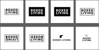
Which is your favourite?
- Thread starter zaksingle
- Start date
Paul Murray
Ultimate Member
Not really feeling any to be honest, but If I had to pick one I'd go for the 2nd, with a revered/outline version of it like no.4.
Paul Murray
Ultimate Member
I think this speaks more of a quirky, young brand, which could be a good thing. It's cardboard furniture for f*cks sake, design studios and trendy coffee shops will love it!.
Plus, I imagine that would work really well on the packaging. A white box/flatpack with that on the front, taped up with white tape that also has that name of the company on it.
Plus, I imagine that would work really well on the packaging. A white box/flatpack with that on the front, taped up with white tape that also has that name of the company on it.
zaksingle
New Member
Cheers Paul, agreed!
Like your thoughts on the packaging too, I've envisioned getting a rubber stamp made to brand the box. I think the above style would look awesome.
Any thoughts on direction from here? I don't know whether to get/commission someone to do a custom jobby of the above, put a shout-out on Facebook to see if anyone can help out so if anyone on here has any thoughts, please shout.
zaksingle
New Member
Cheers for your input CLHB! I did explore this route and do love that style but I really wanted to try and keep things super simple and have the text as the focus of the logo (even though I might be going against this some of the time). Hence why I wasn't so sure on number 7 originally. I don't know, I think what I'm trying to say is I didn't want to have a symbol for the sake of having a symbol in this instance. Or maybe it's just my lack of imagination ha!
Like Paul says I think having a quirky, 'trendy' logo might suit the product and market better, even though it may be less timeless and go out of fashion! I'll have to cross that bridge when the time comes :thumb:
Like Paul says I think having a quirky, 'trendy' logo might suit the product and market better, even though it may be less timeless and go out of fashion! I'll have to cross that bridge when the time comes :thumb:


