Design.Soldier
New Member
hi
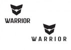
Ok. in a nutshell. im creating a brand identity for a mens jewellery company. this company in very masculine and agressive. based of soldier. i.e. dog tags. i want people to be proud to wear these pieces of jewellery. Yes, the jewellery is very modern and nice looking, but i want to protray the true grit of the brand. i.e. rugged, strength etc. im thinking of my tag line to be. Strength. Pride. Valor....or something like that. (based of the army rank - british - of corporal, two parallel triangle shapes, and a shield. again, my jewellery should make people proud, i.e. the shield on a football (soccer) t-shirt, the family crest etc. please be constructive, im just a student and havnt been to university yet, im just starting out. thank you soooooo much.
p.s. TYPOGRAPHY HELP! please help with my typography, do u know any typefaces that would suit better? kerning and tracking ok?
also the type or logo is not perfect, its still under development, like i still have to make minor adjustments, so lines are not perfectly parallel or aligned etc
also, even if the change or problem is something very very minor still let me know.
thank you
oh, its called warrior jewellery (should i add the word jewellery to the logo)?
