You are using an out of date browser. It may not display this or other websites correctly.
You should upgrade or use an alternative browser.
You should upgrade or use an alternative browser.
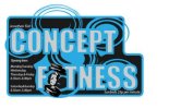
this is a logo design for my local gym
- Thread starter calziee
- Start date
webasoft
Member
logo
I think it suits a local gym and is going in the right direction, try not to put too much info in one place unless there is space for it. Its a bit like trying to carry those plastic large office files, only carry what you can or inevitably you will drop the lot and look silly!:icon_eek: I dont half talk som s%^t but you know what i mean matey. good luck!
I think it suits a local gym and is going in the right direction, try not to put too much info in one place unless there is space for it. Its a bit like trying to carry those plastic large office files, only carry what you can or inevitably you will drop the lot and look silly!:icon_eek: I dont half talk som s%^t but you know what i mean matey. good luck!
Minuteman Press
Active Member
Looks good. I would simplify the opening times.
SparkCreative
Member
Doesn't work as a business card either - all the info is wrong for a business card. As someone else said, it would be ok as a small ad or flyer. Think simple. The logo just need the words 'Concept fitness'. That's it. Maybe use the hand with the dumbell, maybe the blue circles. But nothing else. Play with those elements on white and make them as good as they can be.
Also, if you're going to use outlines on type like that, make sure they sit on the outside of the letterforms, not the inside - they look 'pinched' at the moment.
Also, if you're going to use outlines on type like that, make sure they sit on the outside of the letterforms, not the inside - they look 'pinched' at the moment.
IdealDigital
New Member
If the gym is for both men and women, be careful you don't make it too masculine with the colour schemes. If a large amount of the members are female you may put them off using a big weights as an image. Remember the information is more important than the brand. The offer should be the focal point not the logo.
Katedesign
Well-Known Member
You should try and design in black only at first - a logo will be used on all manner of things from stationery, adverts, T shirts, web, mugs, towels etc. Try sketching (pencil and paper) it will help you get a feel for the designs better. Know who your target audience is - male, female, fitness or body building. Look at what other gyms have as logos. . . As Sparks says just the name/dumbell to start with. . . KISS is the best motto!
Katedesign
Well-Known Member
and do post your ideas. . .
