You are using an out of date browser. It may not display this or other websites correctly.
You should upgrade or use an alternative browser.
You should upgrade or use an alternative browser.
Something is off?
- Thread starter dawn86
- Start date


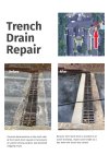
No contact info.
No call to action.
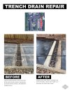
The cord over the drain looks like a crack from a distance - I'd edit that out.
No call to action.
The cord over the drain looks like a crack from a distance - I'd edit that out.
Bottom two images - the one on the right is aligned by at least 1 pixel above the left one... I can spot that with my eyesight so it might even be more than 1pixel
The reason why the images look off is pretty simple... they're not like for like.
Picture on left has fence, different angle and in all honesty looks like it's a frosty morning....
Picture on right has no fence, different angle and looks like it's wet.... it also has the cord which gives a visual break in the picture
In all honesty, there's not really enough of a difference between the two images which makes playing 'spot the difference' considerably harder.
Andrés Gualdrón
New Member
Definitely agree that the contact info is essential and missing! however, don't agree with your other 2 points:No contact info.
No call to action.
The cord over the drain looks like a crack from a distance - I'd edit that out.
1- I don' have the context but it looks like it is a notification to a group of people regardling a public situation that has been solved, call to action is not needed as no action should be required from the public (it is not an ad).
2- Remember that we should always think about the final user reading distance. In this case, the page will either be printed or send as a digital file which should be okay for the user to notice that it is a cable/hose. However, I agree it may not be the best picture and it could look better without the hose.
How do you know it's not an advert - how do you know it's a notification about a public situation that has been solved? How do you know a call to action is not needed???Definitely agree that the contact info is essential and missing! however, don't agree with your other 2 points:
1- I don' have the context but it looks like it is a notification to a group of people regardling a public situation that has been solved, call to action is not needed as no action should be required from the public (it is not an ad).
2- Remember that we should always think about the final user reading distance. In this case, the page will either be printed or send as a digital file which should be okay for the user to notice that it is a cable/hose. However, I agree it may not be the best picture and it could look better without the hose.
In this situation - the people who carried out the works, the words 'Public Announcement' - or something similar would be like a call to action.
At the moment, all this tells me is that some random drain in some random place got a powerwash. There's no information about the key information; who, what, why, where, when... etc.!
How could you not agree about the cord over the drain - it doesn't look good.
You're referring to it as a hose - how do you know this?
Contact info is essential - who do I get in touch with for similar situations or for domestic/commercial issues
Call to action is essential - it doesn't have to be 'BUY NOW' - it can be 'Works Carried Out By XXXX Council on 12/12/2022"
And let's be honest - the layout is terrible.