

essexman
New Member
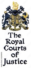
On a recent visit to The Royal Courts of Justice in The Strand, London, I noticed that the typeface used on the main sign outside is also used for large print sign posts and notices in and around the courts (over 100) court rooms accross the inter-linked buildings.
I thought this would be easy to look up. But all I find is a suggestion that the typeface was designed by the Architect George Edmund Street.
Street was at the spearhead of the 'gothic revival' during the mid-victorian period, and the RCJ is his seminal work, which was mostly churches and books on design and architecture.
One of Street's apprentices was William Morris and scans show the closest font to be 'Morris', a recent design based on Morris's original typefaces; but 'closest' doesn't mean close.
Nothing really comes close to the capital R, with the downward slope at the top of the bowl,the decorative 'blade' protruding from the leg. The tilted oval bowl on the lower case 'o'; 'drunk as a judge'?
Has anyone come accross this in digital font, or indeed have any knowledge about the history of the font or a full copy of the glyphs?
I'm assuming it's 'crown copyright' but I need support; clearly.
Thanks for reading.
Attachments
Last edited by a moderator: