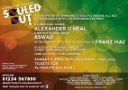
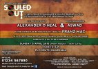
I'd try it on one line and right align to the ampersand.
You are using an out of date browser. It may not display this or other websites correctly.
You should upgrade or use an alternative browser.
You should upgrade or use an alternative browser.
Reggae music event poster critique needed
- Thread starter wavyglanbles
- Start date
wavyglanbles
Member
Something like this?
http://content.screencast.com/users...a3-4de9-a284-7df35f8fa096/2015-01-08_1229.png
Just seems something's still not right.
http://content.screencast.com/users...a3-4de9-a284-7df35f8fa096/2015-01-08_1229.png
Just seems something's still not right.
Hmm I'm not sure if it's good or bad, maybe it's the alignment in the screenshot throwing me off as it looks off center.
Maybe it's the US Based and UK Based text above it that's really throwing me off sitting nowhere it's above or below the line.
I'm not sure if I prefer the other way you had it or not.
If you go back to the other way play around with text sizing to get them appearing more even - I think that's what I was getting at, visually the type doesn't look the same size and it's unbalanced.
I'm sure there is a balance to this - just needs a bit more work.
Have you tried the logo bigger with the text to the right or left of it?
wavyglanbles
Member
@GCarlD
Well-Known Member
I'd remove the "th" from the date and have just Sunday 5 April - as that's how dates are written properly. If it was Sunday 5th of April then it would be fine but it's Sunday 5 April.
Other than that it's fine.
Actually, Sunday 5th of April is the only incorrect way of writing the date. Dates are written exactly as it was with Sunday 5th April, the 'th' removes the need of the 'of' as that is how dates are naturally read. Having 'of' is just an extra unnecessary word. Sunday 5 April is ok too. As long as it is not written as April 5th like in the states, that gets on my nerves! Our day/date, month, year method is perfectly logical.
Anyway to the design at hand. My biggest complaint is the treatment of the text. It has no real hierarchy, it does not direct me and take me on a purposeful journey throughout the poster, when looking at it my eyes go very erratic and tries to look all around at everything at once. I feel you are trying to centre everything too much, mirror and have everything parallel to each other. Even text that you align left or right are centred in their alignment. What I would do is quite literally map everything out on paper first, as I bet you are trying to get it right on screen. Am I right?
Also get rid of the middle patrician going down the middle of the background image.
Last edited:
Have a grammar book open in front of me and it's stating exactly what I've written and I've followed this rule for a number of years and I deal with a lot of copy editors and proof readers who all request dates written this way.
I suppose it's fine either way, I just hate seeing it after doing it a certain way for years.
I suppose it's fine either way, I just hate seeing it after doing it a certain way for years.
@GCarlD
Well-Known Member
If I had doubts I would say ok you're probably right but like you I have been taught this way and have been doing it like this for many years. I'm not going to say how I know for sure, as I don't want to come across as if I'm accusing your editors and proof readers of being wrong, because they are not, BUT it depends on the context - this is very important. In this context for a poster it would be wrong. For example, you can look at any official letter, more often than not, dates are generally written out in full on 'official' letters (not dd/mm/yyyy) you will see there is no 'of' in the date. In terms of things like writing a date in a paragraph of a body of text the word 'of' when stating a date can somethings apply. For example, in the body of a 'government' letter referring to an incident, stating a time and date in full (with the 'of's etc) is important. There are several other instances where it would and would not apply. Using words like 'of', 'that', 'has', 'have' in the wrong context are known as 'Fillers' that's why 'of' is generally dismissed in dates when 'th' or 'nd' has been used, as it is a filler. Fillers are unnecessary extra words that provide no extra information or meaning to the text in question, therefore has no need to be there at all.
Anyway, enough of that, such a minor detail. Let's go back to the bigger question at hand, which the thread was originally intended - the poster design! :icon_smile:
Anyway, enough of that, such a minor detail. Let's go back to the bigger question at hand, which the thread was originally intended - the poster design! :icon_smile:
wavyglanbles
Member
I've aligned the text to the left and got rid of the big ampersand, and I'm happier with how the text is presented.
But more importantly, I felt a background change would benefit. Just experimenting on an abstract bokeh style background, using reggae colours yet giving it kind of a soul feel. (123rf watermarked as I haven't downloaded it yet). Felt the past grunge texture was too much, but more importantly too modern-looking for what would be a throwback 70's-80's event.
Not sure what people think. Nowhere near finished, also planning on doing one half of a large, white reggae icon/shape to fill the left-hand side with maybe 50% opacity.

P.S. I moved the terms and conditions to the bottom right now, since the last picture.
But more importantly, I felt a background change would benefit. Just experimenting on an abstract bokeh style background, using reggae colours yet giving it kind of a soul feel. (123rf watermarked as I haven't downloaded it yet). Felt the past grunge texture was too much, but more importantly too modern-looking for what would be a throwback 70's-80's event.
Not sure what people think. Nowhere near finished, also planning on doing one half of a large, white reggae icon/shape to fill the left-hand side with maybe 50% opacity.

P.S. I moved the terms and conditions to the bottom right now, since the last picture.
@GCarlD
Well-Known Member
That is much more structured and less hectic. I just wish it was portrait!
I'm sure you have noticed each poster you have posted is better than it's 'predecessor' which is a very good sign, shows the progression. Keep it up!
PS. Franz Mac is out of place as it is all far to the right and too close to the edge. Can it go underneath maybe?.
I'm sure you have noticed each poster you have posted is better than it's 'predecessor' which is a very good sign, shows the progression. Keep it up!
PS. Franz Mac is out of place as it is all far to the right and too close to the edge. Can it go underneath maybe?.
wavyglanbles
Member
I'm doing a portrait version as well. My client arranged a deal to have the poster up on a big screen and I mentioned to him that having it landscape would be better for that.
So I have a landscape one for the digital screen, and a portrait version for print.
But I felt that once I get one done, the rest (portrait poster, flyer, etc) will do themselves as they'll be the same.
Went for a walk earlier to clear my head as I had my face on the screen near enough all-day and felt tired and uninspired, helped a lot.
Thank you for your comments CLHB, really appreciate it.
Yes looking a lot more balanced now.
PriyeshDesign
Member
This is perhaps my last attempt to inspire you! :icon_wink:
Have a look at the available flyer/poster designs posted in his blog:
Home | Rodigan's Reggae | The official website of David 'Ram Jam' Rodigan
Have a look at the available flyer/poster designs posted in his blog:
Home | Rodigan's Reggae | The official website of David 'Ram Jam' Rodigan
wavyglanbles
Member
Sorry for the slow response.
Just to let people know that I showed my client the work I've done, and he's more than happy with it.
Thank you for your help guys.
Just to let people know that I showed my client the work I've done, and he's more than happy with it.
Thank you for your help guys.
Good stuff - glad it worked out!
