Reggae music event poster critique needed

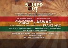
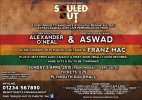
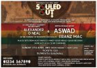
I'm in the middle of making a flyer for a reggae-soul music event.

Can anyone please give me some constructive advice on anything in particular I do to improve it? I'd really appreciate it.

I'm considering adding something else into the background, maybe half a large white circle on the left in a low opacity, not sure yet. Just an idea.
forumcritiqueposter.jpg
 
Last edited:
Hey Wavy, I'm a big fan of reggae music - it's my early morning alarm! :nod:
Working on a music flyer is like working on a magazine design, you have the ability to go over-creative but you also need to be critical.

1. I would recommend a vertical flyer than horizontal, unless this is what the client has ordered

2. Are there any other background alternatives you could play with? However I do like the 'grunge' finish

3. The T&C's section looks lost, it doesn't seem to flow with the rest of the content

4. Experiment with typography, particular the artist/band name and venue date. I think these should pop out the page!

5. You may want to brighten up the flyer like the colours or adding colour?

6. The hashtag line beneath the phone number is that for Twitter or Facebook, if so add the appropriate social icon

7. To help tune up your flyer, you may want to research 'reggae cd covers' for inspiration

All in all, it's nearly there and look out for your margin space!
 
Thank you very much for your comments. I really appreciate it as being constructive helps me out a lot.

My client originally wanted a landscape poster as it will be going on a big screen as well, but I will do a portrait version for print as well. Giving him 2 options.

I will have a look at a different background, the grunge effect is pretty cool but looking back, I think the transparent layer of dark lines makes it too dull and I agree with you that the whole background should be brighter. And will experiment with typography which stands out more.

I will also change the hasthtag details as it was something a previous graphic designer did, and in my opinion it didn't make sense anyway.

Will have an updated version soon.
 
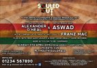
A tiny update on the background so far...changed it a bit and kept it lighter while keeping the grunge effect. Also experimenting with sunbursts, this will be improved.

Also not 100% happy with this font but the best I've played around with at this moment.

forumcritiqueposter.jpg
 
Working progress! :icon_smile:

Why not have the sunburst top centre, so the rays shine down like spotlights but immediately stop before the darken bar at the bottom. You're the designer - try new ways!

Remember to keep the essence of the theme.
 
I think I'm getting some more progress now.

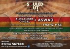
I took your advice PriyeshDesign and placed the rays more central, but also incorporated a disco ball on each side due to the event having soul music as well as reggae.

But the main thing is I've now near-enough tidied up the text and made it stand out a bit. Pretty happy with the font as it's clear to read.

Though I think the top left and right parts is missing something, trying to work out what I can do about that.

What do you guys think now?

forumcritiqueposter.jpg
 
It's very tacky to put your own name and website on a flyer - it's just doesn't look good.

I'd opt for maybe including flyers for the event and business cards at the door or having posters put up around the place to advertise yourself. But putting it on the flyer itself detracts from the impact of the flyer.

And I'm make Souled Out on one line and make it much bigger!
 
Hey Hank

I appreciate the comments but the client wanted me to put my name on there. I'm trying to work out the best way to do it more subtle. And I can't change the logo as it's the company's.

What is your opinion on the poster itself?
 
I made my web address the same size as the Terms and Conditions part and placed them underneath the Ticket Outlets. I'm not a fan of it myself but was something my client wanted me to do.

forumcritiqueposter.jpg
 
Shown it to my client now and just waiting to see what he thinks of it.

Anything you think I could do in terms of improving it?
 
The golden rule about working with any client is that the client is always right, but if you are a perfectionist you could kindly convince them to stick to what you think looks right and works, otherwise your 'amazing' idea gets mauled.

--

The poster looks better than the original. However have you also tried adding musical instruments to the background like a guitar, microphone or drum sticks rather than disco balls. Remember when I said to keep the essence of the theme.

I'm not too sure how your text shadow will print, it may look reasonable on screen but in printing, this may leave a slightly different look.

Hope your client likes it but any criticism should be dealt as positive! :icon_biggrin:
 
I'd make the logo much bigger.

Move the text under the logo up along side and align the logo either right or left, whichever gives more prominence.

I'd then make plymouths no.1 soul night much larger and fit it under the logo not over it.

This would give you more room to spread out the details underneath.


On first glance it looks like a football match promotion, with the two djs pitted to battle against each other - in other words it looks like a "vs" match up.

This is for a number of reasons - mainly the flag in the background makes it look like some sort of South American footballing event. The other reason is the purpose of the event is not strong enough the page (logo and strapline). And by the globe either side makes me immediately think of some sort of global event.

I think spreading out the items vertically would accomplish a cleaner look and make it clearer to read.

I'd make the ampersand much larger to emphasise it.

I really don't like the sunburst in the background. It's a really overused effect.

I don't like the fact the DJs names are all different sizes, gives greater importance the larger they are and lesser importance the smaller they are. It looks really unbalanced.

I'd remove the "th" from the date and have just Sunday 5 April - as that's how dates are written properly. If it was Sunday 5th of April then it would be fine but it's Sunday 5 April.


Other than that it's fine.
 
The poster looks better than the original. However have you also tried adding musical instruments to the background like a guitar, microphone or drum sticks rather than disco balls. Remember when I said to keep the essence of the theme.


Oh that was the other thing, meant as part of my crit in regards to the globes - I'd much prefer to see musical instruments even musical notes, frets, drums, microphones or other artwork synonymous with soul train.

The sun burst background is hideous.
 
I really appreciate the comments Hank & Priyesh. Thank you so much.

I have removed the sunburst now Hank, and it looks much better. And as for the globes, I looked back and it looks too much. Will have an experiment on putting something on the background rather than on the sides.

Will post another update soon.
 
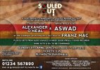
Little update without the sunburst and globes.

Just need to work out what Hank was saying about the logo...the Plymouth's No 1 Soul Night bit has to go on top as that is part of the logo. But just need to work out the alignment of that now...

forumcritiqueposter.jpg
 
Back
Top