Refresh Logo Thoughts

Luke Forestmaster

New Member
Hi guys,

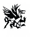
I work on a newspaper with this dragon logo:
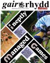
986 - IMG FrontPage.jpg

dragon.jpg

And I don't have the original vector file of logo only this .jpg here. As much as this file is fine and it prints fine I was thinking about recreating it in Illustrator to have a vector for the future (and any design work, e.g. I'm designing awards with the logo on at the moment).

Essentially they don't want to change it, but is there anything you guys would recommend altering?

Thanks in advance for any feedback :)
 
Hi,


I think the dragon itself looks okay.
I would maybe change the positioning of the dragon within the text; maybe it needs to be slightly bigger? I had to zoom in on the first picture to recognise it as a dragon.


Also, not sure if the roundness of the typeface compliments the harsh edges of the symbol.
Just a few of my initial thoughts!
 
I'd probably make it a solid shape. The space in the legs and tail is confusing, though it could probably be left in the wings to serve as highlights if it's done well :)
 
Just to add a few more pointers;

It might be the 'rhydd' that's giving the text and icon a slightly awkward feel. 'Gair' feels smaller (italics) and I think you could tighten the tracking on 'rhydd to match it
 
Hi, cheers @Luke I welcome your comments, but you have to remember that it is a printed newspaper so the dragon is much bigger in the physical form. I'm mainly interested in the design of the dragon itself. The full page was simply to illustrate what it was for. That said, I will look at the 'rhydd' although I think it is mainly the kerning between the 'y' as opposed to the tracking of the entire word.
 
@Paul, I didn't think of that. I agree it might be worth filling in some of the gaps, but the gaps in the head, neck and tail provide it with a sense of dimensionality so I wouldn't want to take too much away from that. It's mainly just one of those problems of being left someone else's design – trying to modify / improve it is always slightly odd
 
Particularly: what do you think about the eye? I think it should come from the top of the head, as opposed to coming up from the bottom?
 
Looks a bit abstract and cubist to me, a bit messy and unclear.

I would suggest an update.
 
Back
Top