Power Revolution Logo

kberry21

New Member
I have been asked to design a logo for a start up company called Power Revolution. The owner is an electrician and has a large amount of work on with some big companies and would like a simple but professional design. He has asked for a specific style lightning bolt to be used in the name, i have also included some alternative design ideas.

I have narrowed it down to 6 nice designs. Colour will be played with at a later date once he has selected a few logos he prefers. May i ask some of you to take a look and critique them or share any ideas you may have. Also do you think the plain helvetica font is a poor choice? I did not want the font to be too fancy or playful due to the line of work and the icons in the logo.

Thanks
KassiePowerRevolution-04.jpg
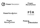
 
Could be better if the plug had 1 pin shorter than the other, and it resembled a person cheering with 1 fist in the air?
 
You've got some nice design ideas there but you should hit your client up with some choices with colour from the off. Don't wait for him to select which ones he prefers first, as once he sees them in colour it could influence his decision. Nice ideas though but as you gathered the only real problem is the font. You have 6 options with 5 of them being the same font, so you're not showing him any variation. There are 100s+ 'non-fancy' fonts to choose from that is not Helvetica. You should choose a font that he wouldn't already have on his own computer.
 
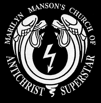
The issue that I have with the logo concepts is that the lightening bolt he's chosen to use is identical to the one used by the band Marilyn Manson on such niceties as Antichrist Superstar and The Church of The Antichrist....
nk_church_of_the_antichrist_superstar_emblem.jpg


The lightening bolt is reportedly derived from the Nazi SS icon.


Anyway....... carry on. :)

Luckily, it just so happens that the best option is the one without the lightning bolt. But that's just my opinion. :icon_smile:
 
Thanks for your opinion guys, i will relay the message regarding the lightning bolt incase he wants to go with a different one. I have given him a few more options with different fonts, and also put the colours in that i had in mind.
 
I like the middle right. Get the concept nailed then move to colour. A real logo needs to work in mono first and foremost.
 
Thanks for all your insights guys, i have since further worked and refined the logo design and the client has selected a final design. He selected the middle right layout as can be seen above, however it was with different fonts and selected colour. I thought it was a suitable choice.
 
I like the idea having the fist at the other end of the lightning bolt though it might end up a little over the top, unless that's his style. The image I had in my head is like, Image - TinyPic - Free Image Hosting, Photo Sharing & Video Hosting, which unfortunately is a kind of communist logo too...

Personally I think the middle right is the most "professional" - as in the somewhat dry, corporate sense - must be the serif font. But PR makes it look like a Public Relations company IMO...

You've got two O's in the words to play, with wrt the "Revolution" concept. The mark in the upper left reminds me of the now universal "power button" icon motif. Maybe a bit more tie in to that might bring out something nice: https://www.google.co.uk/search?cli...er on graphic#q=power+on+icon&rls=en&tbm=isch
 
Back
Top