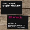
Personal business cards

Paul Murray

Ultimate Member
Ok, so I'm looking to take advantage of Boss's amazing business card deal this weekend and came up with this quick concept for a two-sided design. What are people's thoughts? I wasn't sure about the Magenta on the reverse but I think it helps take the edge off all the white type on that side.

Business-Card-mock-ups.jpg

*Edit* Just noticed a few kerning errors in the type, though I'm blaming that on Photoshop distorting the image :D
 
Thanks, I've made a few changes since (sorted the kerning in 'paul' and aligned the comma to the i below it). I'm gonna take a fresh look tomorrow when I'm not so tired :)
 
Probably not since I don't think spot UV is included in Boss's deal :icon_biggrin:

Hopefully the magenta (well, it's actually 100% M, 20% Y I think) will work against the black without gloss. I'm not really a fan of UV if I'm honest, unless it's done well :)
 
I'm debating it.

I'd like to think people would think to check the domain name in my email address, but you know how confused some people can get. Also I don't think the domain name will fit in with the contact details (ties in with "get in touch"). I don't really want to include the address on the other side either, if I can help it as I really like the simplicity of just the statement.
 
Like em. Much prefer the 2nd version. Though I'd make the info text slightly smaller and add your web address - it's amazing how many people will miss that.

Really like the typeface by the by, what is it?
 
Ok, I've narrowed it down to two options. I think I know which I prefer but I'd like everyone else's opinions before I part with my hard-earned...

Option 1
CardMock1.jpg

Option 2
CardMock2.jpg
 
For me with the www. ...just looks strange without it although everyone does know to add it when typing it in their browser.
 
I prefer the top one... but it wasn't until I read Boss Hog's comment that I could even see the difference!
 
Without the www: as a general rule (neither hard nor fast) I'd probably include it but here I think you get a bit of an undesirable visual effect having 'paulmurraydesign.com' repeated on consecutive lines when it's only very slightly misaligned.

Nice card, by the way.
 
Back
Top