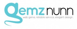
New personal identity - "Gemz Nunn: Web Genie"

gemznunn

New Member
I'm hoping to restart my freelance web design business, so I'm starting off by redesigning my personal brand. The idea was inspired by a friend who described me as a "web genie" who'd appear and make web design wishes come true! (Very cheesy, I know, but I quite liked the idea.) I'd appreciate some constructive feedback on the logo so far.
genielogo.jpg
 
My view would be that this is one of those designs where you know there's something there but you can't work out what it is.
 
I know what you mean. I've been playing around with it today and, based on some suggestions I've had from people on Twiter and Facebook, I've made some significant changes which I believe are for the better. I'm currently debating which of the ideas below I should continue with.

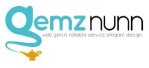
logofinal.jpglogowithlamp.jpg

Without or without the lamp? That's what I'm wondering at the moment. The "g" on its own appears to work well as a stand alone logo and it downsizes reasonably well, although the logo with the lamp is more difficult to see.
 
I know what you mean. I've been playing around with it today and, based on some suggestions I've had from people on Twiter and Facebook, I've made some significant changes which I believe are for the better. I'm currently debating which of the ideas below I should continue with.

View attachment 1734View attachment 1736

Without or without the lamp? That's what I'm wondering at the moment. The "g" on its own appears to work well as a stand alone logo and it downsizes reasonably well, although the logo with the lamp is more difficult to see.


I would go with the lamp personally. The concept of a genie doesn't come across with just the g on its own. But I agree the sizing the lamp needs a bit of playing with.
 
Definitely agree you need a lamp (and to review the sizing) but I'd also refine the 'g' a bit more - sort of has the tendency to look like a sperm / tadpole. But definitely an improvement
 
It's gone from facehugger to sperm? Lol :)

I'll have a play around with it. Was thinking that it might be a good idea to reflect the wisp or change the shape of it to make it look more like a lowercase g with the lamp at the bottom. The strapline needs to be changed as well, but I've got a copywriter friend who's going to help me with that.

Thanks for the feedback so far, guys. Much appreciated!
 
Finally finished it and pretty happy with the finished result. (See new avatar - shiny!) Thanks for the feedback, guys!
 
Last edited:
Yea, the G on it's own definitely doesn't look like a genie. I'm also not so sure you need to include a separate lamp vector. I prefer the first version with the more stylized lamp, but like Dave said, it needs some refining.
 
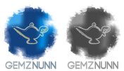
Don't you just hate it when you get to the end of a project and come up with a new idea for it? That's pretty much what happened to me this afternoon. I had a brain wave and ended up creating two more ideas for my logo! I'm just not sure which one I should pick and finish.

Do I go with the shape cluster logo or the watercolour-inspired logo? What do you guys think? (They're in colour and grayscale for comparison purposes.)

overlap.jpg
wc.jpg
 
Got to agree with Sam. Definitely a gravy boat. Now I'm hungry. I wouldn't use the 2nd one either. Shapes look too complicated to me.
 
You guys aren't the first to say it looks like a gravy boat, so no offence taken. :) This is why I like to ask for opinions when I'm not sure about how something looks. Fresh sets of eyes see stuff I don't (even the obvious stuff, but you know what it's like when you've been staring at the same thing for ages.)

Since the first idea has proven to be the most popular (based on feedback from several places), I'll finish developing. I'm going to re-jig the shapes and hopefully that should fix the problem.

Thanks for taking a look, guys. :)
 
Last edited:
Back
Top