You are using an out of date browser. It may not display this or other websites correctly.
You should upgrade or use an alternative browser.
You should upgrade or use an alternative browser.
My flyer
- Thread starter doyle369
- Start date


chris_17
Member
Hi,
It's a good start, however I would make a few changes.
- The text at the top is too long IMO, I'd take the key parts out and display them another way.
- You're using two different fonts, I'm guessing to differentiate between Wash and Valet, but you also have it in the intro text at the top.
- Things don't line up particularly well either.
djb
Member
People are probably just waiting for you to stop updating it!
There's no price on the Bronze Valet headline. Is this on purpose ie cleaning a Metro/Range Rover doesn't cost the same).
This is ideal as a maintenance valet every week or two. Just a suggestion for the text.
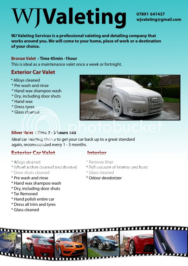
I thought it looked nicer without the picture of the shampooey car.
Should Pre wash be hyphenated?
Tar Removed. Capital R in removed should be lower case.
Other than that very nice, just stop changing it every hour and expect people to comment on a bank holiday weekend!
There's no price on the Bronze Valet headline. Is this on purpose ie cleaning a Metro/Range Rover doesn't cost the same).
This is ideal as a maintenance valet every week or two. Just a suggestion for the text.
I thought it looked nicer without the picture of the shampooey car.
Should Pre wash be hyphenated?
Tar Removed. Capital R in removed should be lower case.
Other than that very nice, just stop changing it every hour and expect people to comment on a bank holiday weekend!
SparkCreative
Member
I agree - the one before you put the soapy Audi on it was getting there. I'd lose the 'film edge' effect around the pics - it looks dated and I'm not seeing the relevance.
And change the asterisks* for proper bullets • (option 8 on a Mac, not sure on a PC).
And change the asterisks* for proper bullets • (option 8 on a Mac, not sure on a PC).