My first attempt at graphic designing

T Boris Snobworth

New Member
I tried my hand at doing some graphic designing some years ago. I was trying to do a logo and never really thought about it being on something smaller than a computer monitor. Done it on I believe photoshop and illustrator. The photo I took was from my old cooker. It you can't make out the writing which I would not be surprised says cooking up beats productions. When I look at it now I think that the black background was not a great idea and cannot find a copy of the version I done with a white background instead. Right now I do wish I had the original file to hand so I could redo it agin for my label 'cooking up beats' but am thinking of trying to make a new one or find someone on here that could do a new design for me. Anyways have a butchers and tell me what you think of it.
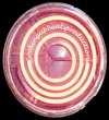
cooking up beats logo.jpg
 
Without being too harsh as it's your first attempt with no design experience and only your second post on the forum :icon_smile:

...its bad and fails on many different levels (sorry). You could carry on trying to improve it yourself although you would need to start from scratch.

To be honest there is so much you need to learn I would just pay someone to do it and concentrate on what you are good at.

Hope that helps
 
The concept behind the logo is good, there is room for development linking the sound waves from a speaker and the cooker hob rings, but im with the boss the technical side and execution of design is somewhat missing.
Still a good level of creative thinking going on for a first attempt.
 
With all the comments I've had so far I would not take any of them a an insult. I have no clue what is the technical side or execution of design is. You would have to dumb it down to play school level for me.

BTW Semiproflea it was so long ago I done this that I don't even remember the reason why I choose to use the cooker ring, but it was miles better then the previous ideas I had before and I'm happy you could link sound waves to the cooker ring. Thank you both for your comments. :icon_smile:
 
Surely your reason for choosing the cooker hob is down to the name, cooking up beats productions? The link to sound waves would arrive through a natural design process of research and development.
Where i mention technical side and execution of design, create the logo in vector format so it can be used across different formats and sizes. I would also consider how the background and text will react to a size reduction, text may very well become illegible.
You want to aim for a clean, simple design thats all. Attached is an example of a logo similar to yours,
Screen shot 2012-03-28 at 16.13.06.jpg
 
I understand what you mean now. I remember when I was doing it I did think to myself it was not good because the writing could not be seen when small. I tried to do the lettering bigger but I did not like it. I did not want to use the first letters of the name [C.U.B] cause it makes me think of the sports team. As for the link to the sound waves, I must just be jammy. The reason it's called Cooking up beats is when I first started learning who to make computer music I set up my studio in my mums kitchen and my friend said to me 'you cooking up beats in the kitchen?'. Un-interesting but true fact.
 
Back
Top