Looking For some Feedback

GWD

New Member
Hey Guys,

I've been working on a couple of in house projects and was hoping that you would offer me some feedback.

My software of choice is Serif Draw Plus X5, I know it's buggy and some may even look down on it, but it works for me.

the 2 designs are quite different but I'm sure you'll agree would have to be so.

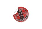
The GWD logo is a drafted out re-vamp of our current logo. and to be fair it's completely going in a different direction. however I think it now needs to be as our company page has now taken a much more corporate feel.

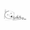
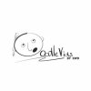
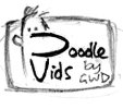
The doodle vid logo is a new service that we will be offering and is very much a more fun service, whilst the end result is impressive it's a video production service using simple graphics and text. this needed to be conveyed but the fun element still had to play a big part in it (the character with the pen behind the ear represents the D of Doodle).

if you can decipher my waffle, I would greatly appreciate any feedback you have to offer.

Thanks to you all

 

Attachments

  • P1.jpg
    P1.jpg
    7.1 KB · Views: 32
  • dv.jpg
    dv.jpg
    5.4 KB · Views: 30
  • GWD ORIGINAL STICKER LOGO FILE AT 300DPI.jpg
    GWD ORIGINAL STICKER LOGO FILE AT 300DPI.jpg
    9.2 KB · Views: 25
(the character with the pen behind the ear represents the D of Doodle).

I'll give your thread another read later to get my head round it properly. But just as a quick observation, I don't see the character with the pen forming the letter 'D,' if anything it looks more like the letter 'b.' But maybe I am looking at it wrong.
 
I'll give your thread another read later to get my head round it properly. But just as a quick observation, I don't see the character with the pen forming the letter 'D,' if anything it looks more like the letter 'b.' But maybe I am looking at it wrong.
hi there and thanks for the feedback. I've re-sized the pen slightly to improve the resemblence of 'd'
dv.jpg
 
Sorry, but it doesn't look at all like a D to me. Just looks like a O or even a C. Not sure about the second d in Vids, either.

I know it's difficult designing logos for yourself, but I think all of them are overworked - just too much going off.
 
have to agree that it isn't looking like a D, also you seem to have a heavier stroke to the left hand side of the 'head' which again makes it more of a C ?
 
I hate to appear over critical or negative but that just doesn't work to form a D (in my opinion of course).

The biggest issue when you design for yourself is because you know exactly what you are wanting to achieve your brain naturally sees it straight away. but if you have a few outside folk (namely us) saying they can't see it then I think it might be time to do some re-thinking?

This isn't perfect by any means but maybe start playing with a face in profile rather than face on? This is me just mucking around for 30 seconds in Illy, but I think the side profile of the face is going to give you more scope

qpld9y.jpg
 
Last edited:
I hate to appear over critical or negative but that just doesn't work to form a D (in my opinion of course).

The biggest issue when you design for yourself is because you know exactly what you are wanting to achieve your brain naturally sees it straight away. but if you have a few outside folk (namely us) saying they can't see it then I think it might be time to do some re-thinking?

This isn't perfect by any means but maybe start playing with a face in profile rather than face on? This is me just mucking around for 30 seconds in Illy, but I think the side profile of the face is going to give you more scope

qpld9y.jpg

This is exactly what I was going to suggest. You beat me to it lol.
 
Hi Guys,

Thank you all so much for the feedback. i'm a big boy so no hard feelings towards anyone who feels they may have been over critical.

completely agree with you spotty penguin the amount of clients i get who have done their own logo and not listened to the input of others runs into the hundreds now. and funnily they all say the same...."well...I Knew where i was going with this!" and thats just it. you get som caught up in your own ideas you forget that its not actually yourself you need to attract. so thank you for opening my eyes to a school boy error.

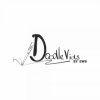
after deliberation i'm completly droppping teh face. whilst the side profile does help and gives a lot more scope. i just cant find a way that really works and keeps in with teh style of the logo. i have kept the pen as the videos are compiled in a smiliar way to videoscribe, so i want to keep the flowing text and pen elements. to be fair i think it really is a great improvement ......Thoughts????
dv.jpg
 
Back
Top