Logo Feedback

Athos

Active Member
Hi guy's,

Long time no see! *life...U know..*

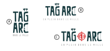
Today i'm here because I want to have some feedback on something I'm working on! I work on a logo for my archery tag activity for kids (detail : I'm from Quebec) and i'm a little bit stuck on this 3 versions. I want you to help me determine what is the best option, what works and what doesn't works. So, feel free to let me your comment

Regards.declinaise tagarc.png
 
Is it archery?

You say Tag Activity in the description
It says Tag Arc in the options.

Just wondering.

Becareful of too much detail - will be lost at smaller sizes
1714731491739.png
 
In my opinion - the detail is lost at certain sizes

I'd focus maybe on the double as
TAG
ARC

Make the C like a bow - but limited detail
and an arrow between Tag Arc

TAG
--->>
ARC

Careful not to make the C look like a backward D
 
Is it archery?

You say Tag Activity in the description
It says Tag Arc in the options.

Just wondering.

Becareful of too much detail - will be lost at smaller sizes
View attachment 8807
Yes archery, I'm in Quebec so ARC in french is for Bow..The logo will be use in a normal size but yes agree about the fact that too much detail will be a prob! Thanks a lot!
 
View attachment 8809

I'm going to keep sizing it down - think of Social Media icons - Fav Icons

Then in terms of complexity - you may not need it now - but for embroidery - and for other things - like Silk Screen t-shirts has limits for smallest size, you're talking about 0.7mm in th smallest area on positive print and about 1.2mm in negative print

(positive print being what you're showing here on a white background)
(negative print being it reveresed out white in colour printed on a dark background (like a black t-shirt))


It's really difficult to know - as some have ET in them
And some have different tag lines.

As it's for archery - would it be awkward to arch the tagline around the top half of the logo to make it look like a target?
Then I think the Red ET in the middle would almost be a bulls eye.

Anyway - they are nice - just strip out detail
Less is more.
 
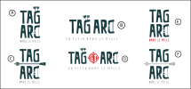
Finaly drop the arrows out, as you said if i reduce the size it's to hard to see...So, I think I will keep this one :

montage arc tag2.png
 
As I keep telling you - it isn't going to work well with the details
I think it's almost there. But it's still too detailed.
If you like it then go ahead, obviously.
For example, I am struggling to read the red text.
The string on the C will be completely obliterated in some print scenarios.

Up to you.
 
Hi guy's,

Long time no see! *life...U know..*

Today i'm here because I want to have some feedback on something I'm working on! I work on a logo for my archery tag activity for kids (detail : I'm from Quebec) and i'm a little bit stuck on this 3 versions. I want you to help me determine what is the best option, what works and what doesn't works. So, feel free to let me your comment

Regards.View attachment 8806
The font is really cool! I like how sans-serif allows for a less formal look, which combined with the sharper edges evokes a sense of adventure. But the asymmetrical style also hints at a younger target audience. I love the use of space and implied lines in the archery visuals. I'm a beginner and still a student, but to me your designs are clever and nuanced. I reckon (A) is the most appealing, only just over B. Possibly because more of the focus is on the name rather than the catchphrase. Or because the square tallness gives an illusion of strength and intensity. Something like that. Please don't stop, your skills are real!
 
Back
Top