You are using an out of date browser. It may not display this or other websites correctly.
You should upgrade or use an alternative browser.
You should upgrade or use an alternative browser.
logo design critique please
- Thread starter Laurajanedesigns
- Start date


Laurajanedesigns
Member
Thanks for the reply
it does look rather huge when viewed like this, but i have put it on a business card and it looks quite good
it does look rather huge when viewed like this, but i have put it on a business card and it looks quite good
Laurajanedesigns
Member
it looks really blurry as a jpeg! how annoying
Corrosive
Well-Known Member
it looks really blurry as a jpeg! how annoying
Yes, it does a bit doesn't it. I'm sure that will be taken into account though.
Laurajanedesigns
Member
Laurajanedesigns
Member
nope. whats the best file format?
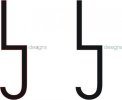
The thing that strikes me is that the logo creates a bit of an awkward footprint (I can't think of any I've see which are as tall and narrow) and that the size difference between the LJ device and the 'designs' bit is huge (the 'design' bit is rightly smaller but I feel that the balance here is weighted too far the other way).
First thing I'd look into is a shorter, fatter shape for LJ, I think.
First thing I'd look into is a shorter, fatter shape for LJ, I think.
Corrosive
Well-Known Member
The thing that strikes me is that the logo creates a bit of an awkward footprint (I can't think of any I've see which are as tall and narrow) and that the size difference between the LJ device and the 'designs' bit is huge (the 'design' bit is rightly smaller but I feel that the balance here is weighted too far the other way).
First thing I'd look into is a shorter, fatter shape for LJ, I think.
I think DaveL has put what I was trying to say in a much better way :icon_biggrin:
Laurajanedesigns
Member
ok thanks, i just wanted the 'designs' to become a part of the top of the 'J' if that makes sense? Ill try making the LJ less bold, and then as you mention, a shorter fatter shape for LJ
Laurajanedesigns
Member
I think the concept is good but the LJ motif is waaaayyyyy too big IMO. Imagine fitting that sensibly on a business card or on a website banner...
what does IMO mean?
Paul Murray
Ultimate Member
"In my opinion"
Crazy teen-speak")
Crazy teen-speak
Corrosive
Well-Known Member
Crazy teen-speak
*gulp* might be time to stop talking like a teenager then...
Laurajanedesigns
Member

Ok guys i have done a few more and this is my favourite...
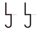
I preferred the original LJ combination, I think. Was thinking something a bit more like this (very quick job, with the right-hand idea offering a more complete use of the space):

Laurajanedesigns
Member
Thanks for taking the time to do these! I really like the one on the right. What typeface did you use for the 'LJ' ?
Katedesign
Well-Known Member
Play with it a bit more...
linziloop
Member
I think there is some awkwardness about both of your versions Laura. As others have mentioned about the first one, I think you would find this difficult to work with in certain scenarios such as a website as it will create awkward white space around it and take up a fair bit of length on a page.
The newer, more landscape orientated one has a better use of space but I think at the moment is looking a bit weak. I think a really good idea may be to get some tracing paper, trace over what you have, and then change it, a little every time you trace it - kind of morphing it into something else as you go, playing with different line widths, perhaps even change the case of 'designs' so you don't have the g hanging down and are able to play with that word as more of a shape than text.
The newer, more landscape orientated one has a better use of space but I think at the moment is looking a bit weak. I think a really good idea may be to get some tracing paper, trace over what you have, and then change it, a little every time you trace it - kind of morphing it into something else as you go, playing with different line widths, perhaps even change the case of 'designs' so you don't have the g hanging down and are able to play with that word as more of a shape than text.