You are using an out of date browser. It may not display this or other websites correctly.
You should upgrade or use an alternative browser.
You should upgrade or use an alternative browser.
Logo advice
- Thread starter Benchelt
- Start date
Too many colours - consider print costs for larger volume work.
They'll need a single colour, and maybe max 3 colours - in Pantone References.
You've got 5 colours here.
Simplify the colours.
Lose the notches on the end of the banner.
My idea would be 2 colours using Pantone Colours
Wirral + Leaf + Community = Green
<have the leaf coming out of the ground from the below:>
Organic Growers = Brown
Web Address = green
Then a version in black and white (some people still fax)
A version in 1 colour all green.
A version in 1 colour all brown.
A version in CMYK
And HEX version for the web/email collateral.
Consider losing the web address out of the logo altogether. Websites can change and it can be costly to change all their collateral.
If people are on their website do they need to see a logo with their address on it? They're already there.
So a version with and without a web address.
They'll need a single colour, and maybe max 3 colours - in Pantone References.
You've got 5 colours here.
- Wirral = green
- Leaf = different green
- Community = brown
- Background = grey
- web = black
Simplify the colours.
Lose the notches on the end of the banner.
My idea would be 2 colours using Pantone Colours
Wirral + Leaf + Community = Green
<have the leaf coming out of the ground from the below:>
Organic Growers = Brown
Web Address = green
Then a version in black and white (some people still fax)
A version in 1 colour all green.
A version in 1 colour all brown.
A version in CMYK
And HEX version for the web/email collateral.
Consider losing the web address out of the logo altogether. Websites can change and it can be costly to change all their collateral.
If people are on their website do they need to see a logo with their address on it? They're already there.
So a version with and without a web address.
Wardy
Well-Known Member
There's too much going on there for me. Definitely lose the web address.
The branch doesn't sit well to me there. If it was me I would make the branch come out of the W right at the beginning and have Wirral Community in dark green (that mid green disappears a bit on your website).
Then Organic Growers in small caps underneath, maybe spaced out a bit. Nice and simple and compact. Or at least make it more of an obvious simple sleeper without the perspective bit.
Either that or I would try putting Organic Growers in a circle and make it more of a stamp?
Btw, there's a couple of typos on that home page.
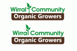
For me the top one - the leaf out of the ground makes sense rather than hovering.
Lose the detail in the leaf - or make it wider - it's far too thin.
Try not to have really thin lines - that includes the stems of the leaves.
It looks a tiny bit squashed, can you loosen the spacing between the letters? It will make it a bit wider, but far better for legibility.
Lose the detail in the leaf - or make it wider - it's far too thin.
Try not to have really thin lines - that includes the stems of the leaves.
It looks a tiny bit squashed, can you loosen the spacing between the letters? It will make it a bit wider, but far better for legibility.
sprout
Active Member
There is also an issue with the width of the words ‘Wirral Community’ against the bottom slug. On the top one it is too wide and overhangs. The bottom is too narrow, as you have aligned the edge of the characters with the slug. This second is closer, but you need some optical compensation. As it stands, although actually aligned, it appears indented. This is due to the way the brain sees positive vs negative space.
The words in the slug need a bit of attention too. The negative space is a bit awkward in places.
I’d also look at perhaps making the angles at the bottom of the slug round, rather than flat – a bit more organic looking.
Overall though, I think you could dig a bit deeper. The idea is one we’ve seen many times before. Don’t get me wrong, it’s fine. It does it’s job, but in a very prosaic way. Perhaps I am being too critical and not every job has to be a show-stopper, but it just feel a bit like you stopped at your first idea.
What is unique about this group, compared to other similar groups? Given that you volunteer, you should have good insight into this. The job of a logo like this – in fact any logo – is to embody the values of a company or organisation (this doesn’t happen overnight), not just outwardly-facing, but it also needs to be an emblem for members to stand behind and feel they are part of. Their flag that represents all they are proud of. It needs to represent their efforts and endeavours; that which makes them unique. To me, this all feels a bit too generic.
I am not advocating the standard go-to of a map of the peninsula, but with a bit of thought, there has to be something that sets them apart. What makes you go back every week to volunteer? Your job is to communicate that. Of course that’s too big a job for a logo to do, but it needs to be an identifiable vessel to carry this emotional content.
Hope this helps.
For a basic logo for a volunteer group it doesn't have to be amazing.
If Rockstar Games posted their logo for critique we would slam it. Same with Google and Apple.
Apple very literal. Google too childlike.
Rockstar Games too cheap looking.
At the end of the day, it's a group that volunteers.
Think about a word only version for tshirts, caps, boxes, bags, etc down the line.
I think as a community project it's going to be ruled by the camel is a horse designed by a committee.
Maybe try Wirral much larger then community undneath in smaller text.
Organic growers slightly smaller than community.
You might then condense the whole thing into a narrower more stacked version.
Giving appearance of growth upwards (with letters getting larger the further you go up).
You could still have the leaf thing but in Community.
Maybe show some roots into the brown to illustrate roots in the community.
Doesn't have to be complex.
sprout
Active Member
For me, it is as important to get it right for small groups / companies as it is for larger ones. Arguably, even more important. They have harder to fight for recognition. Granted, this one doesn't exactly need extensive brand penetration!!For a basic logo for a volunteer group it doesn't have to be amazing.
The problem with logos like the google one, is that often they have evolved from earlier kitchen table logos and once that emotional capital is there, you are stuck with evolving it from that point. Which is why, if you can, it helps to get it right from the start.
Anyway… I know this is all getting a bit esoteric when we are actually talking about a local organic growers’ group, but what they heck, a bit of theoretical extrapolation can’t do any harm! As I said, I am likely being too critical and this job doesn’t require being so in-depth, but it just goes to show… actually, I’ve no idea what it just goes to show…
Seems I’ve had too many coffees this morning!
Yeh you have a point.
At the same time... I don't know anymore...
Hope the op gained some insight
At the same time... I don't know anymore...
Hope the op gained some insight
You'd like to think branding is important no matter what the company size but honestly it's becoming a bit depressing seeing what is being passed off as 'good' these days....For me, it is as important to get it right for small groups / companies as it is for larger ones. Arguably, even more important. They have harder to fight for recognition. Granted, this one doesn't exactly need extensive brand penetration!!
As a community volunteer group it's not bad.
For a business and branding, maybe want more from it.
I've learned to adjust the bar over years depending on the group involved.
But I like it. I'm not opposed to it.
For a business and branding, maybe want more from it.
I've learned to adjust the bar over years depending on the group involved.
But I like it. I'm not opposed to it.
Woocksie
New Member
I couldn't say it better!You'd like to think branding is important no matter what the company size but honestly it's becoming a bit depressing seeing what is being passed off as 'good' these days....
Benchelt
New Member
Cheers, I agree.Looks good to me apart from not being centred properly. If I'm being picky the plant/tree is a tiny bit too high and Wirral Community I would have slightly bigger -
it's probably an optical illusion but the bottom lettering looks bigger than the top lettering.


