sxnset
New Member
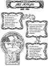
Hi, I was a little afraid to post here because I'm a beginner at graphic design and the things I do right know probably look hideous, but I really want to get better and learn through critique. These are a few "infographics" I made about certain periods in art history, the infographics are supposed to look according to the theme. I will accept any constructive criticism, thanks!


