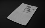
How Gravity Works (cover)

Paul Murray

Ultimate Member
Howdy, I'm looking for some feedback/opinions on the cover for a little booklet I designed last year.
how-gravity-works-1.jpg

Whilst I'm happy with the interior design, the cover has always bugged me as it was slightly rushed to meet a uni deadline. At first I liked how simple it was, and other's have commented saying they like the simplicity, but I'm hoping to get a run of them printed to sell at print fairs and send off to a few design sites/blogs, and feel the cover needs to be a bit more enticing and creative, maybe something on the back perhaps?

You can take a look at some of the interior pages that feature a few diagrams here to hopefully get a feel for the general art direction – How Gravity Works (the back is basically the same grid continued across, with no text).

I've got a few ideas but they all seem to be lacking somewhat when I try and execute them. I think I might be a little burnt out after finishing my degree and organising our final show.

Any suggestions/opinions?
 
Inside is gorgeous. Really like the style. Well done. Yes the cover is a bit lack luster. I to like simplicity but thing that something is missing. I dunno, replace one of the grey lines in the grid with a solid black one that continues onto the reverse?
 
I like the design as well and I see what you mean about it lacking something.

For me, the cover looks too much like the inside if you know what I mean? I'd try reversing the colours of the cover. So it'd be a black or dark grey cover with white/light grey text and lines. You'd have kept the uniformity with the font size and linear elements, but the cover as a whole might look a lot punchier. (I realise this might bump up the print price though :angel:)
 
Cheers for the feedback guys. Here's an image from an idea I've been playing around with recently. This is a nod to the story of Newton getting hit on the head by an apple, but it's all modern and upside-downy.

gravity cover.jpg

I'm having trouble getting it to work, mainly due to the way it's printed. I tried blowing the image up but this fills the page almost with ink. At the minute I'm printing these myself at home onto sheets of newsprint (which is not as easy as you'd think!) and I can't do large areas of black mainly because of the cost, but also because it can bleed through the page quite easily. I've looked into riso printing, but obviously that also doesn't do block colour very well.
 
I like the design as well and I see what you mean about it lacking something.

For me, the cover looks too much like the inside if you know what I mean? I'd try reversing the colours of the cover. So it'd be a black or dark grey cover with white/light grey text and lines. You'd have kept the uniformity with the font size and linear elements, but the cover as a whole might look a lot punchier. (I realise this might bump up the print price though :angel:)

Yes I was going to suggest something similar to this but then I thought maybe it is good that the front relates to the interior so well. The fact that the same style is maintained throughout is what makes it work, so when you see the front cover, you instantly know what to expect inside. I wouldn't suggest making any vast changes, just maybe a subtle added element or an edit to what you currently have. Try not to overwork it as you don't want to lose its simplicity.
 
I wouldn't suggest making any vast changes, just maybe a subtle added element or an edit to what you currently have. Try not to overwork it as you don't want to lose its simplicity.

I think you're right. I was considering just adding something to the back that implies gravity, as I think what it needs is just something to make it a little more interesting.
 
Back
Top