Logo Authority
Hi Kezzer , Nice to meet you.
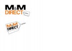
After seeing your logo , I think we need to think about what Internet Company's do and understand the way in which they symbolize their authority. A good example of what I'm trying to explain is this site
Very - Womens, Mens, & Kids Clothing | Furniture, Electricals, Homeware & More . What do you notice about their logo ?
Its 100% Typography
The way Internet branding has changed in the past few years certainly is that , Logo's have grown ever increasingly reliant on raw format text but displayed in unique ways.
Another good example of unique stand alone typography branding is this logo ( Courtesy of logopond.com )
( What do you notice about this logo ? Each character is defined and clear , You can tell its professional although it remains a unique company by the quirky character change in the middle ... minor things can have huge impacts and provoke thoughts into the customers mind ... things which you might not have even explored or considered prior to this post ( You probablly have so i'll drop the condescending tone now... *Dropped* )
What do I think your doing wrong ?
I think your focusing on the sidelines of Internet branding , and branding in general... I.e. Combining text with image ( not that this isn't acceptable but it must be done in a controlled and suited way ) where as branding is more abstract now adays ... hence stand alone typography.
Personally what do I think you should do?
Limit yourself to say ... a 150 x 150 pixel box... and explore typography , ( this is because its always challenging and exciting to work within limits and boundaries as thats when you overcome issues in usually very creative manners and persona's )
- Vary Size
- Vary Height
- Vary Fonts ( Although as usual K.I.S.S applies , thus maximum of 2-3 fonts )
- Vary Colour
- Vary Layout
The options are endless , ... Hope this helped


")