Feedback Please!

PebbleBeach

New Member
Hi all, I'm new to the forum.

I've been designing stoof for about 3 years now. I don't really know any other designers personally, so its hard getting feedback on my work. That's why I'm here. I'm hoping I can get some good feedback from more experienced designers, and get some pointers on what I'm doing wrong, and where I can improve.

So you had a bad day? trod on lego barefoot? no nuts in your snickers bar? well take it out on me! rip me to pieces, don't hold back. I want to improve! :)

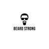
First one is this logo I did just for fun.
 

Attachments

  • BEARDSTRONG.png
    BEARDSTRONG.png
    88.3 KB · Views: 18
I am with fisicx on this; what is it for? If it is design, it has to have a reason. There needs to be a brief, even if fictitious. If not, then it’s art, design has to have a practical purpose. Art does not. So, on that score, what was the brief? Please give it some context, so that we can critique it. Without that, it’s just an image – neither good, not bad.
 
Looks like George Michael and also can't stop seeing a dummy now. It's not really a logo as it doesn't tell us about the company. If it's just an image for a
t-shirt or something it's not really obvious what it's supposed to be.
 
Looks like a set of sunglasses, some 'afro' style hair and a kettlebell weight for a beard/mouth.

It's an 'ok' idea but it could really be refined and objects made more/less obvious if you get me.

As others have said... no idea what it's for though.
 
I am with fisicx on this; what is it for? If it is design, it has to have a reason. There needs to be a brief, even if fictitious. If not, then it’s art, design has to have a practical purpose. Art does not. So, on that score, what was the brief? Please give it some context, so that we can critique it. Without that, it’s just an image – neither good, not bad.

I understand all that, I'm not totally clueless.

I suppose I'm just looking for critique on the aesthetic qualities, what I could do to improve the look of the icon, and the type. If the type is a good match for the icon, if the kerning is OK etc.

Maybe I should have made myself clearer in my original post. Lets just say its a logo for a fictituous company which sells beard cream.
 
Back
Top