Fancy Things - Illustration Work / Dot Design

dot design

Member
Like the last one I posted here this is one in a series of self initiated A3 sized illustrations. Pen and paper doodles/drawings are scanned in and vectorised, parts of the drawings are then used, refined and coloured in Adobe Illustrator and worked into the typography. Drawing the shapes by hand rather than just drawing on the computer adds a more natural and organic feel, and keeping in the rough edges that drawing with pen and paper gives.

Feedback etc appreciated!
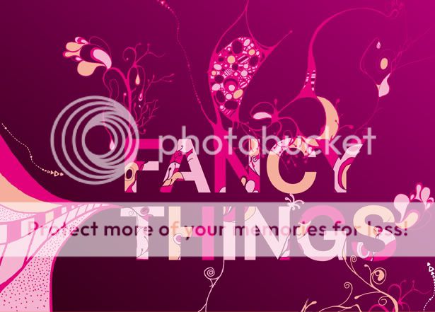
fancythings615pixelswide.jpg
 
Dot Design

Love it! Especially the patterns on the text.

The colours are cool too!

Do you do freelance work? I sometimes need specialist illustrations for projects so if interested please pm me.

Thanks
Joanne
 
Like the last one I posted here this is one in a series of self initiated A3 sized illustrations. Pen and paper doodles/drawi...

It looks pretty, the only thing i'd have done is centered the text within the "x" axis.
I dunno how it came, but i've falled for 'The pink" color ^^
Great work. ;)
 
I think the text balances quite well the way it is aligned.

Sometimes you can use centred text too much and it has no visual interest.

As I've said before mate, i love these illustrations your doing and it works really well in that graphical piece above :icon_thumbup:
 
Thanks for the feedback ZerroQ, we all have different design tastes and its good to discuss design in this way, so I do appreciate your views, makes us all better designer.

Got to agree with Pixels Ink (I would though:icon_biggrin:), I prefer it left aligned , thanks for the thumbs up Col!:icon_smile:
 
Like this a lot. The colours hit me first and my initial reaction was very good. The bg works well with it too, a good piece.

:icon_thumbup:
 
Back
Top