You are using an out of date browser. It may not display this or other websites correctly.
You should upgrade or use an alternative browser.
You should upgrade or use an alternative browser.
DJ logo
- Thread starter NUGFX
- Start date
MJ96
Member
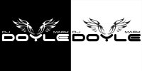
I like the wings but I think as you've centralised them in the Y the Dj and Mark throw it all off balance. I dunno, maybe I'm wrong but that's how it looks to me on first viewing. Perhaps you could separate the wings from the text (keeping the Y backbone) and see how that works, alternatively he could just go by his surname!
spottypenguin
Active Member
I like the wings, no offence, but to me the font & graphic don't sit well together. Also I think I would be looking at making the wings into the "Y".
Talking of the wings they are reall, really familiar so I don't know if you want to make them a bit more bespoke?
Talking of the wings they are reall, really familiar so I don't know if you want to make them a bit more bespoke?
@GCarlD
Well-Known Member
I think what you've done is good but it doesn't exactly scream DJ to me when I first see it. I think you need to choose a slightly different font. I think the wings idea being the backbone of the 'Y' is a nice touch. I'd also get rid of 'Mark' his first name, DJ DOYLE has a much better ring to it and will look better on your current design.
dcp-web-designers
New Member
Hi,
I think the logo looks good, I like the wings idea but not sure the DJ should be so small, probably the most important word on the logo so should be defined clearly. Try putting the DJ between the wings so it stands out and bit more. I agree with the above comment and remove Mark if possible. DJ Doyle sounds better and then the DJ text can be put between the wings.
I think the logo looks good, I like the wings idea but not sure the DJ should be so small, probably the most important word on the logo so should be defined clearly. Try putting the DJ between the wings so it stands out and bit more. I agree with the above comment and remove Mark if possible. DJ Doyle sounds better and then the DJ text can be put between the wings.
