You are using an out of date browser. It may not display this or other websites correctly.
You should upgrade or use an alternative browser.
You should upgrade or use an alternative browser.
Design advice please - BR Testing
- Thread starter haygy
- Start date
Paul Murray
Ultimate Member
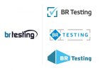
I prefer the middle one, though I'm not keen on those colours.
Paul Murray
Ultimate Member
I like the blue of the original, perhaps find another that could compliment it, rather than just black.
Sam Cowley
Member
I would probably say the last one. I dont know why it just seems like it fits the company and it's abstract and well done. Saying that I also like the middle one as it stands out. Hope this helps!

